
Capital
Banking and fundraising tools for founders and startups.
Capital
Banking and fundraising tools for founders and startups.
/ Summary
I led the design of Secure Inbox, Banking Welcome Experience, Fundraising, and Team Management for mobile and web.
/ team
Executive stakeholders
Jordi Hays, Sarah Chase
Head of product & design
Brandon Jacoby
Design
Dimitri Knight
Design collaborators
Sarah Bai, Andrew Ettinger
Developer collaborators
Brian Armstrong, Bryan Lee, Spencer Schoeben, Clayton Brand, Tyler Cagle, Angela Xu, Alice Jin, Varun Arora, Bret Selby
/ Websites
Capital
Welcome Experience
Improved the experiences onboarding, gradual ramp-up and continued usage of Capital on mobile and web. Focused on simplifying user increasing familiarity with the app's feature set, increasing customer deposits and funds raised, and throughout, infusing Capital's elegant and personable brand.
Welcome Module
/ Capital / Product Design
Inviting new founder to funding their account
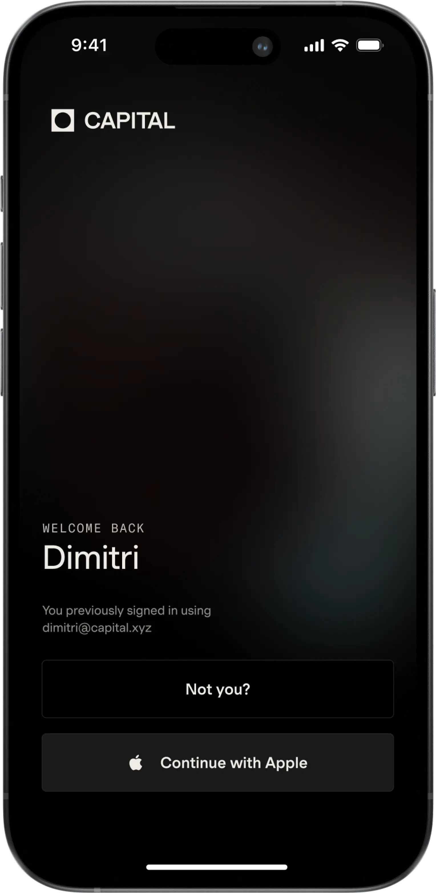
Sign In
/ Capital / Product Design
Welcoming back founder to sign in.
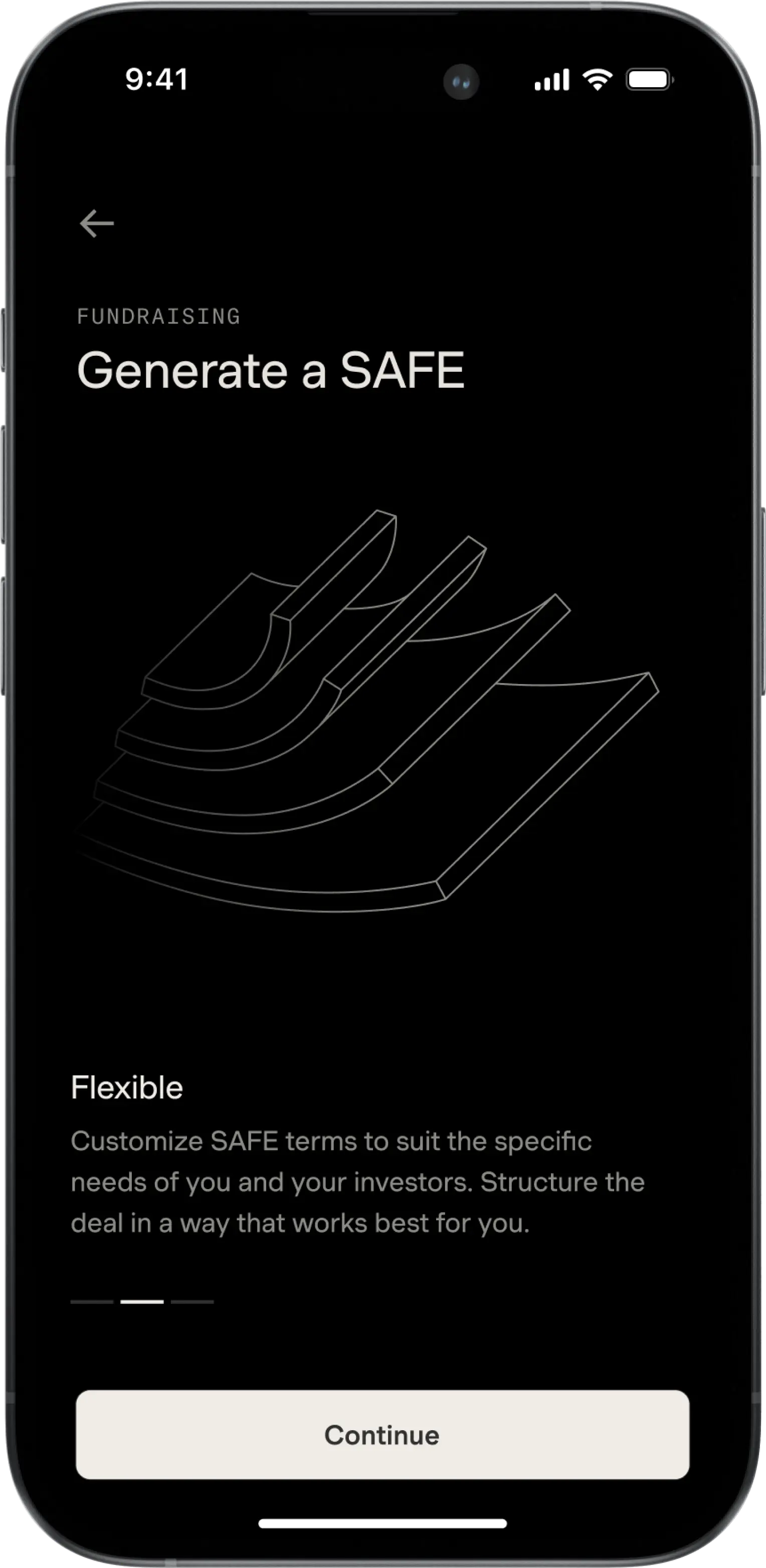
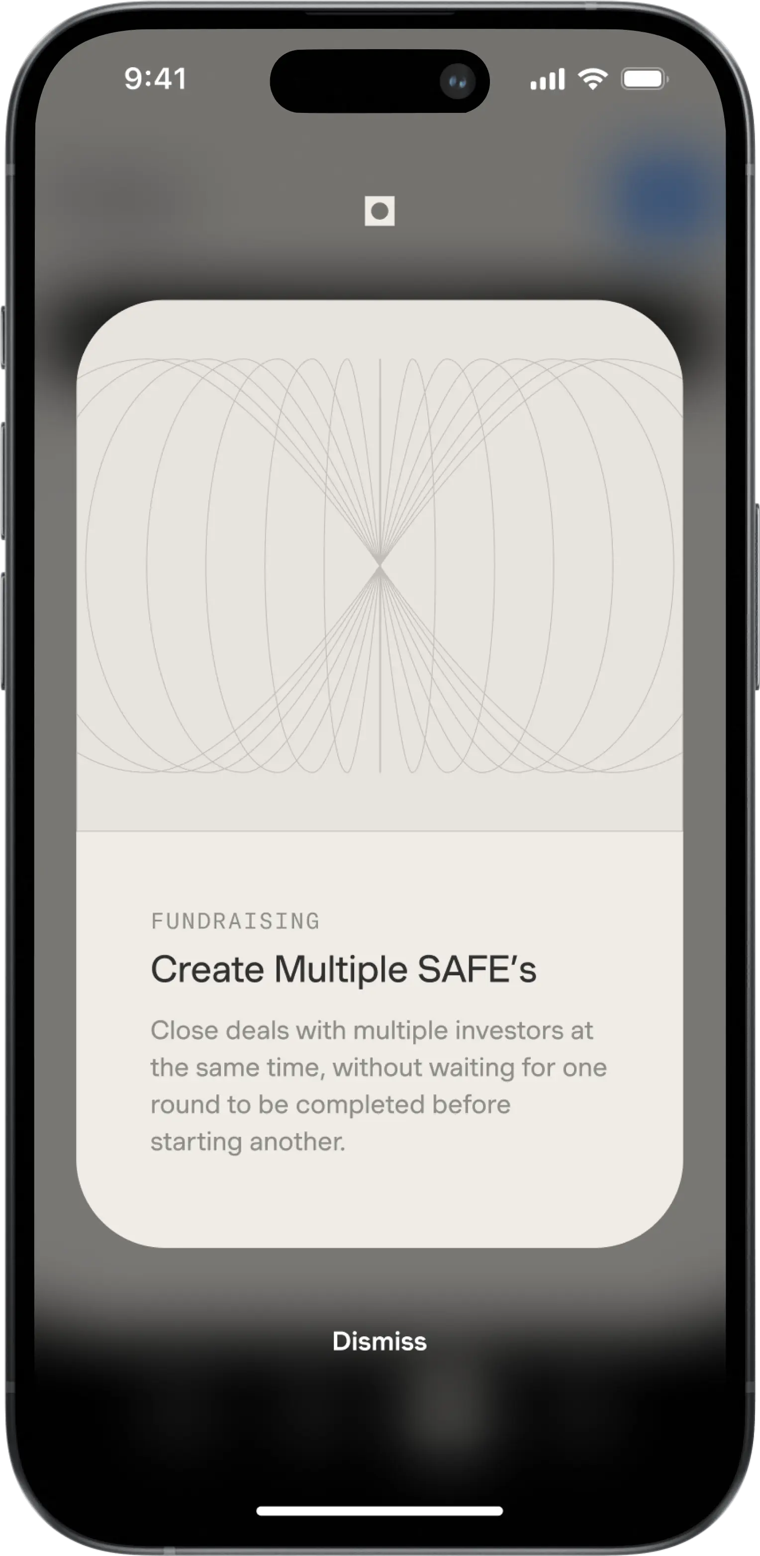
Feature Interstitial
/ Capital / Product Design
For new founders, carousel introducing generating SAFE
App Update Modal
/ Capital / Product Design
Modal introducing new features following app update.
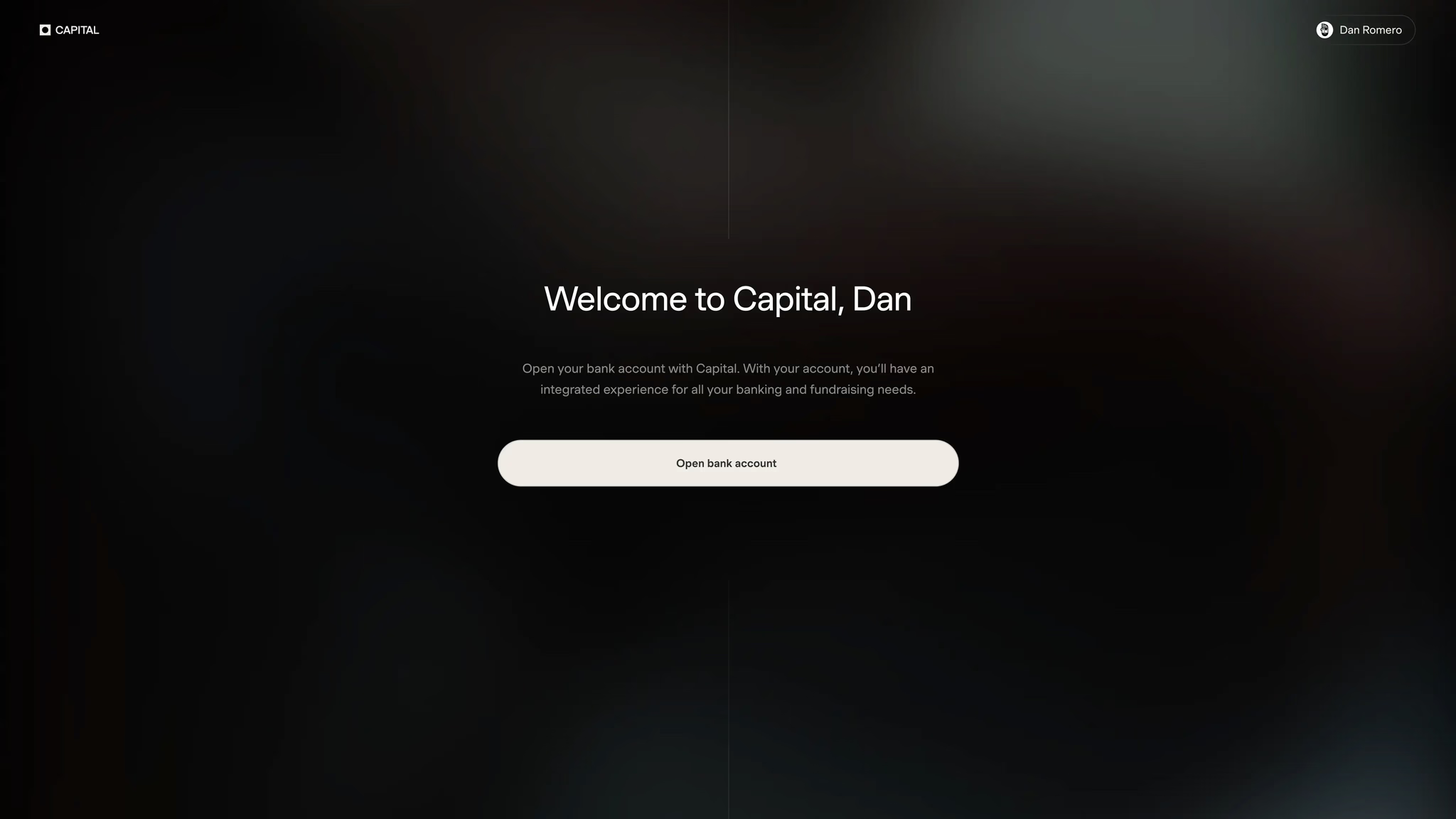
Welcome to Bank Account
/ Capital / Product Design
Upon KYC success, completion founder is welcomed to Capital.
Welcome to Bank Account
/ Capital / Product Design
Upon KYC success, completion founder is welcomed to Capital.

Loading Screen
/ Capital / Product Design
Processing Capital account creation step by step.
Loading Screen
/ Capital / Product Design
Processing Capital account creation step by step.
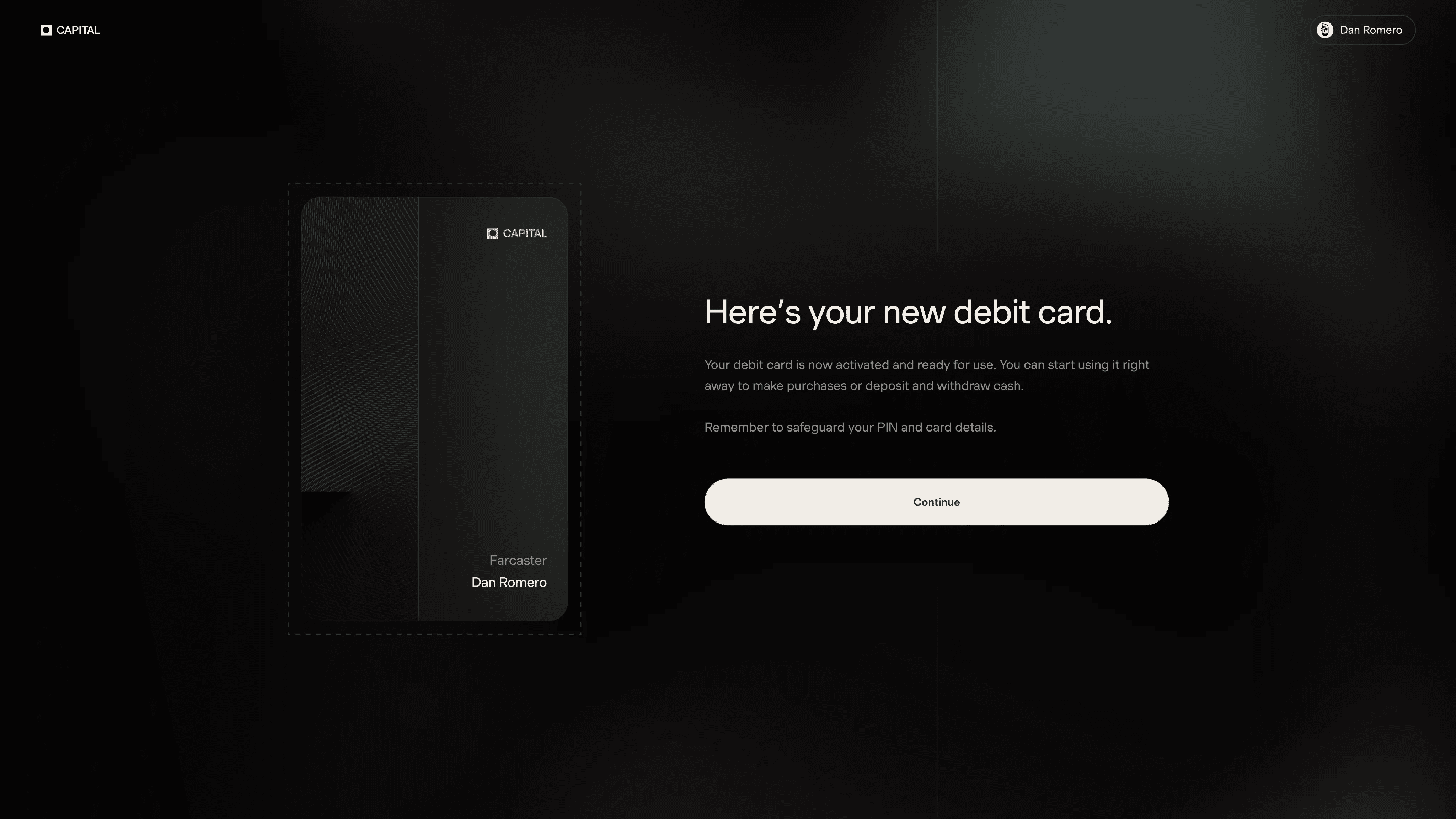
Debit Card Issuance
/ Capital / Product Design
Founder issued new debit card.
Debit Card Issuance
/ Capital / Product Design
Founder issued new debit card.
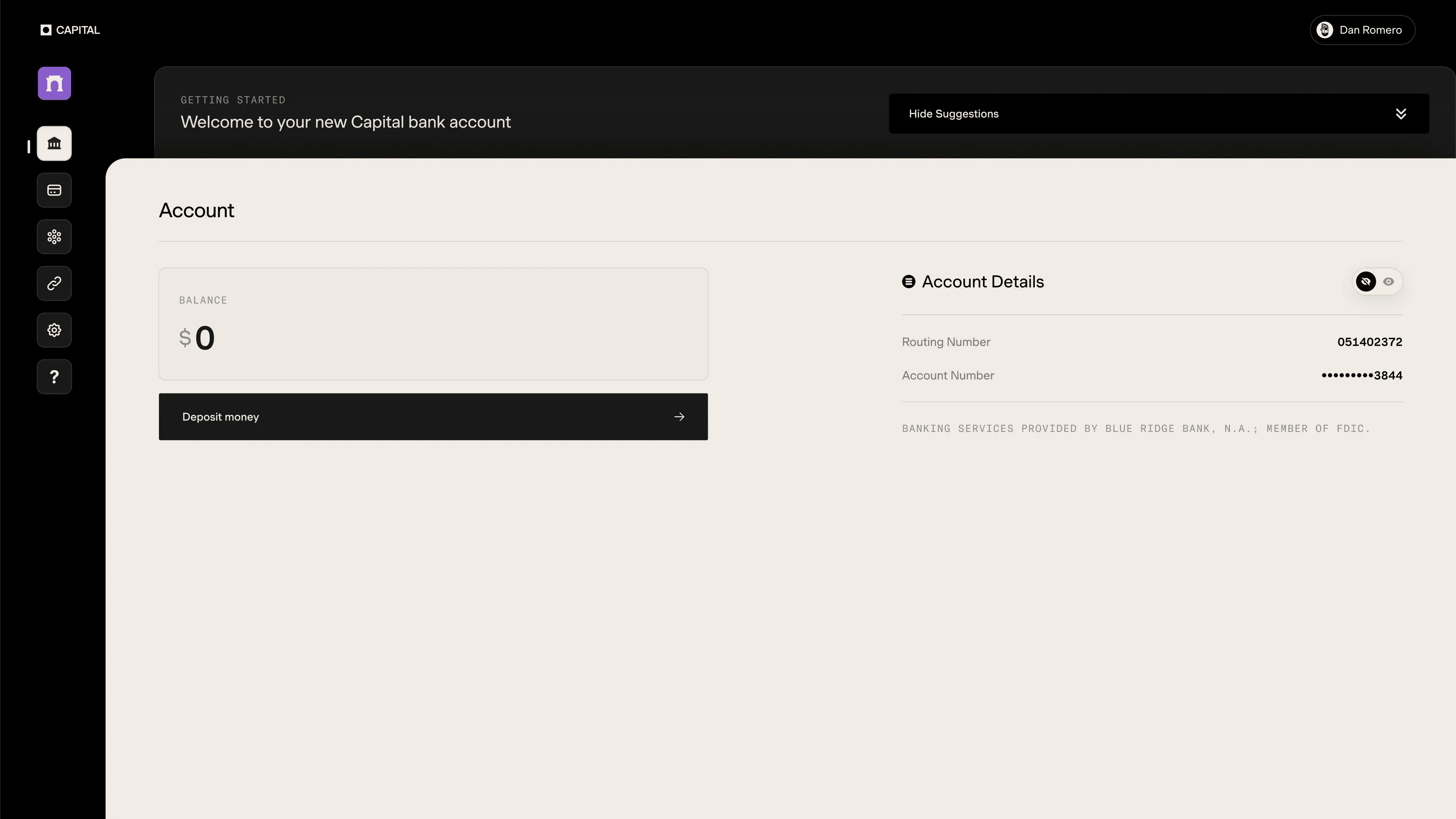
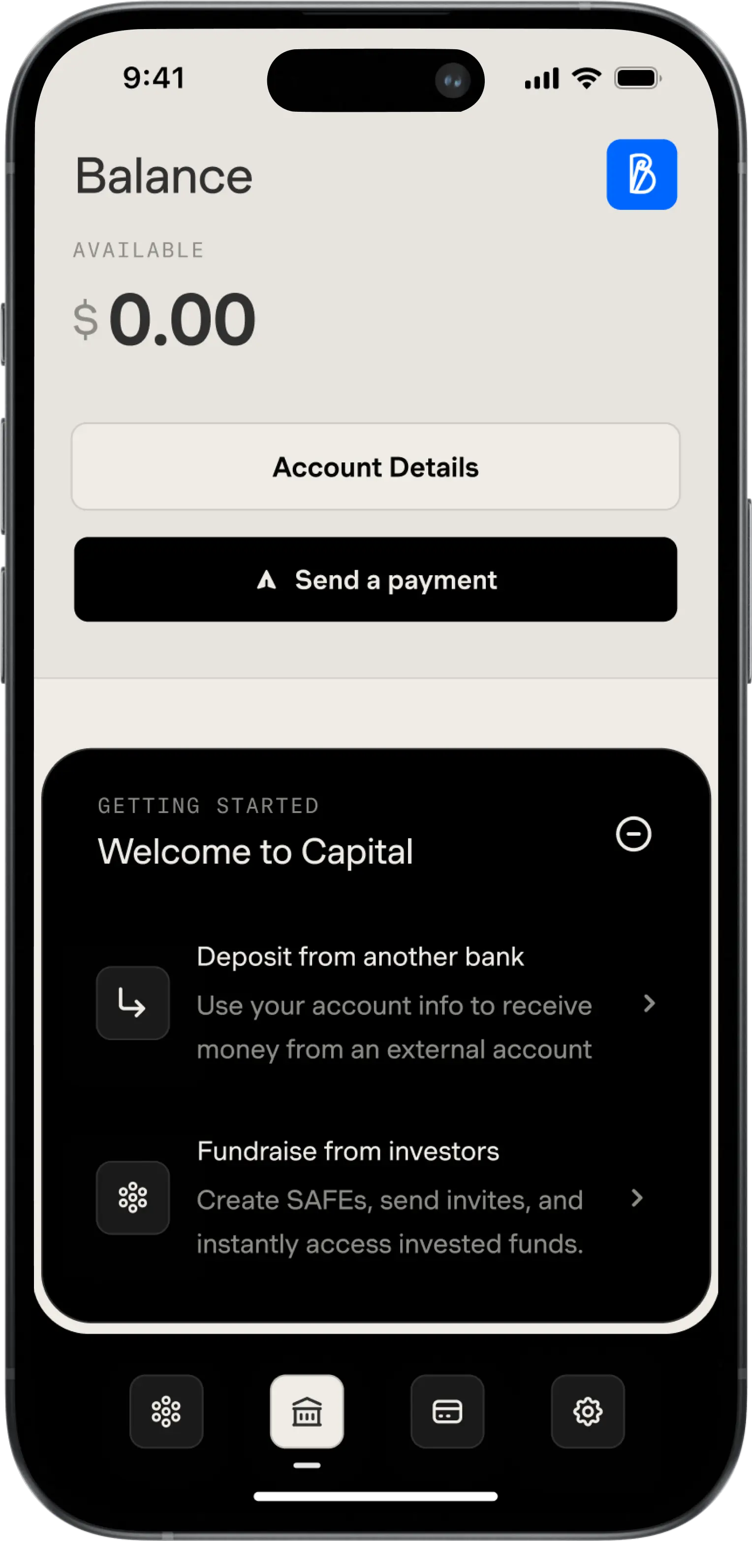
Suggestions Module, Closed
/ Capital / Product Design
Suggestions module closed
Suggestions Module, Closed
/ Capital / Product Design
Suggestions module closed
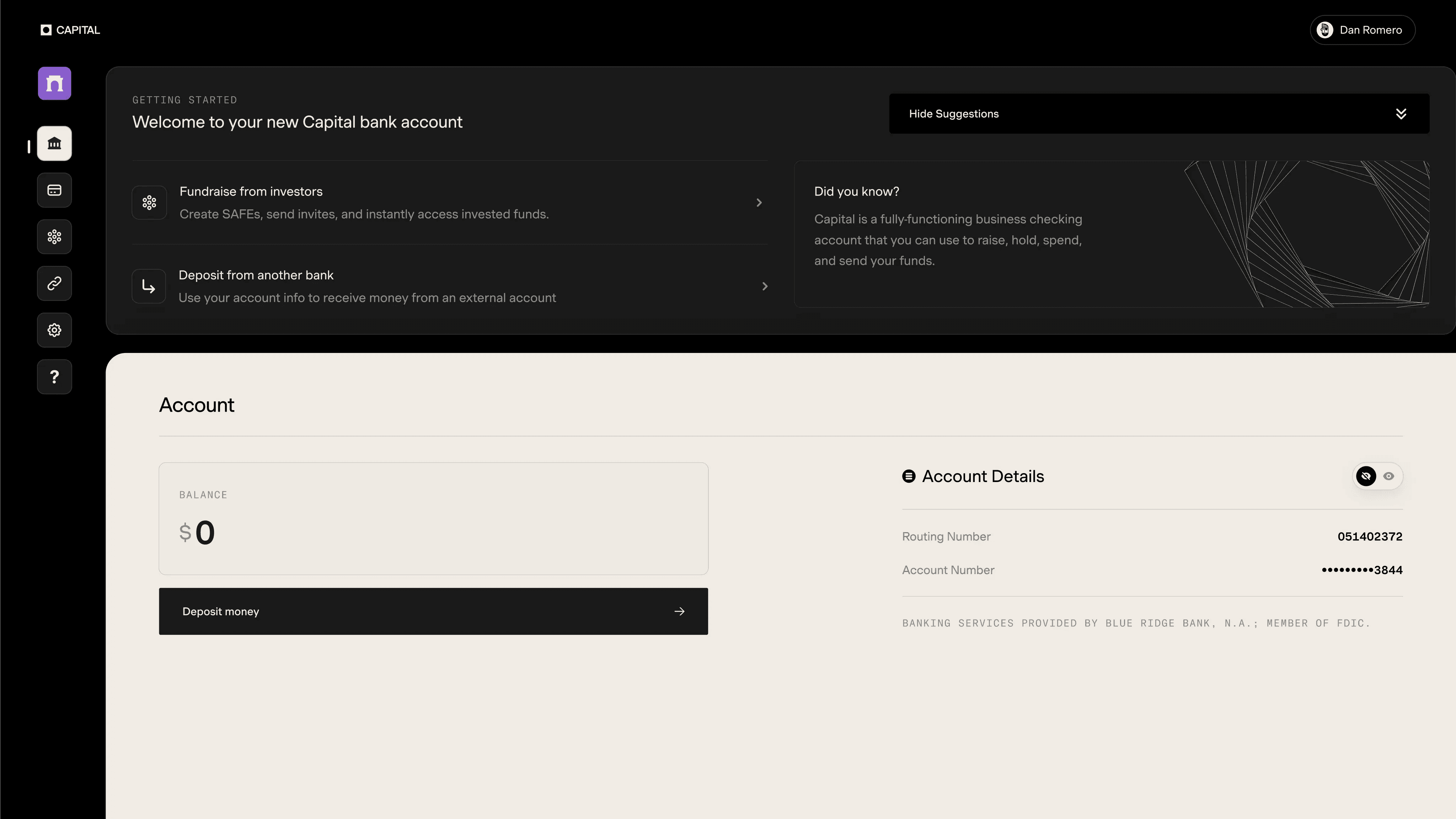
Suggestions Module, Open
/ Capital / Product Design
Suggestions module open, suggesting founder to fundraise or deposit funds.
Suggestions Module, Open
/ Capital / Product Design
Suggestions module open, suggesting founder to fundraise or deposit funds.
Problem
Despite successfully attracting the right users and providing a smooth onboarding experience, Capital faces a crucial challenge: a significant portion of new company profiles fail to fully engage with the platform. These profiles, although created, often remain dormant, lacking in fund deposits, debit card acquisition, or fundraising activities. This gap in user activation leads to missed opportunities for both growth and deepened customer engagement, posing a critical problem for Capital's aspirations to expand its user base and increase active participation.
Solutions
To tackle this issue, we designed an innovative 'Welcome Experience' that bypasses traditional product walkthroughs or tutorials. Our approach includes a multifaceted strategy: implementing a welcome module that offers clear, immediate steps for account funding, creating informative interstitials to highlight and explain new features, integrating tooltips for additional guidance on app functionality, and revamping the sign-in page to greet users personally. Additionally, we overhauled the KYC (Know Your Customer) onboarding process with enhanced interaction and visual design, making it not only educational but also engaging. These changes aim to simplify user interaction, increase familiarity with the app's features, and, crucially, boost customer deposits and funds raised, all while maintaining Capital's elegant and personable brand identity.
Results
Following the implementation of the 'Welcome Experience', Capital observed a notable increase in the percentage of company profiles with a non-zero balance, indicating successful conversion of signups into active, financially engaged users. User feedback reflected a reduction in confusion about Capital's features and offerings. The emotional resonance and engagement of the first-time user experience were significantly enhanced, as evidenced by increased user interaction and positive user testimonials. This holistic approach not only addressed the initial problem of user activation but also strengthened Capital's brand loyalty and user satisfaction.
Team Management
Introduced a self-service 'Manage Team' tab, streamlining the process with intuitive team member management, role adjustments, and secure invitation systems, significantly reducing CX team dependencies and enhancing overall business agility and productivity.
Team Management
Introduced a self-service 'Manage Team' tab, streamlining the process with intuitive team member management, role adjustments, and secure invitation systems, significantly reducing CX team dependencies and enhancing overall business agility and productivity.
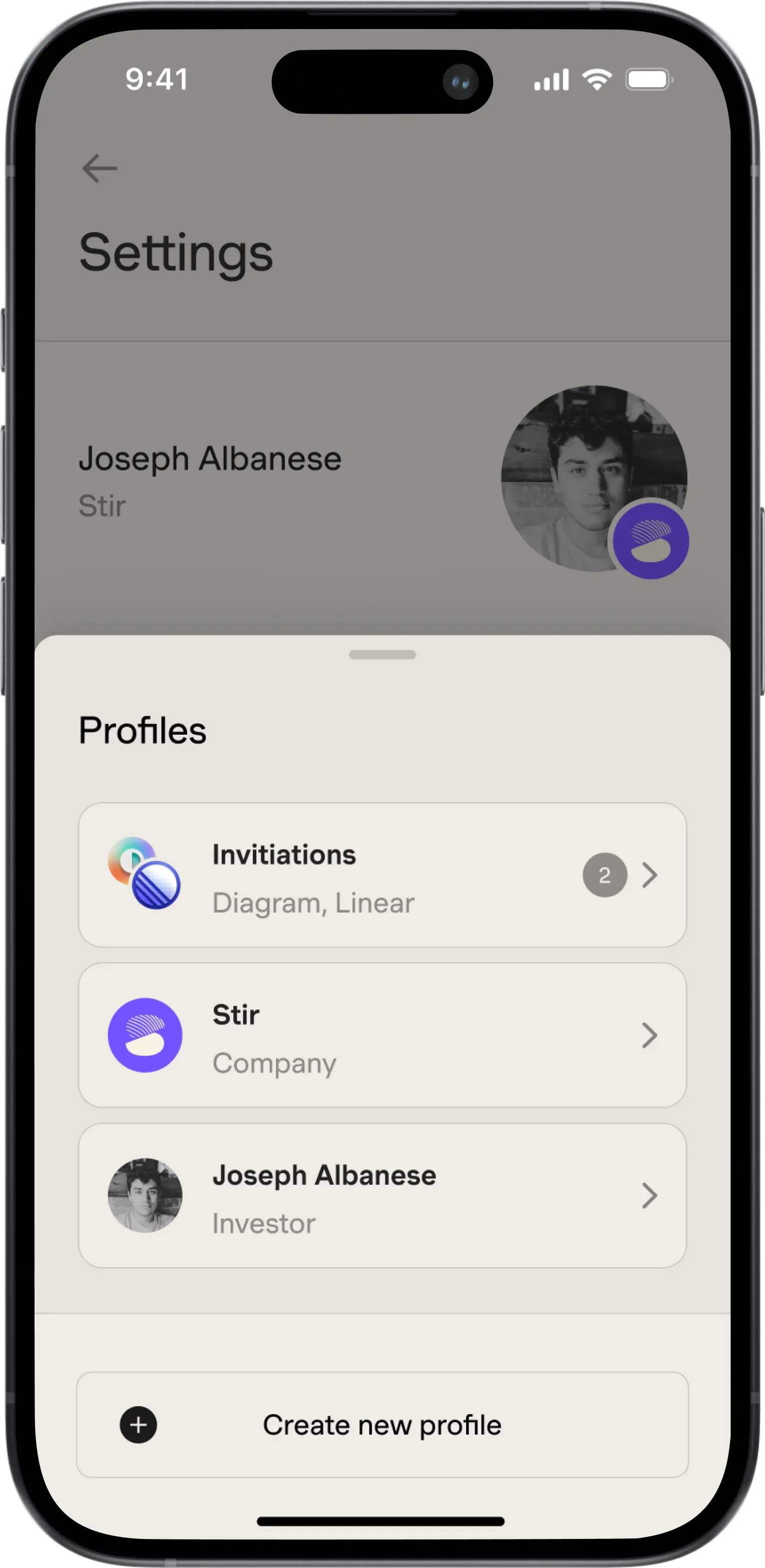
Profiles
/ Capital / Product Design
View invitations and switch profiles.
Problem
Historically, the process of managing team members on Capital profiles has been cumbersome and inefficient, heavily reliant on the intervention of the customer experience (CX) team. Founders and investors had to endure a time-consuming process of requesting the addition of teammates through back-and-forth communications. This outdated approach significantly hindered the expansion and collaboration capabilities of teams, impacting the overall agility and productivity of businesses using Capital.
Solutions
To address this bottleneck, we engineered a new 'Team Management' feature, enabling seamless self-service for team expansion and collaboration. This solution is anchored in a new 'Manage Team' tab within the Capital app's Settings section, offering a comprehensive suite of functionalities tailored to different user roles and permissions. Key features include the ability to view and manage team members, handle pending invites, adjust roles, transfer ownership, and remove teammates. Additionally, we introduced an intuitive invitation system, allowing team owners to invite new and existing users with ease. The system is designed with security and efficiency in mind, ensuring that user roles and permissions are handled effectively while providing a streamlined onboarding experience for new team members.
Results
The introduction of the 'Team Management' feature led to a substantial reduction in the dependency on the CX team for team additions, thereby significantly speeding up the team management process. Founders and investors now enjoy the autonomy to manage their teams directly, leading to improved collaboration and a more efficient onboarding experience for new members. Feedback from users highlighted the ease of use and effectiveness of the new system, with a marked decrease in CX-related queries for team management.
Secure Inbox
Developed a feature that allows founders to share their account details effortlessly and securely with others via email, enhancing user experience and increasing the platform's utility.
Secure Inbox
Developed a feature that allows founders to share their account details effortlessly and securely with others via email, enhancing user experience and increasing the platform's utility.
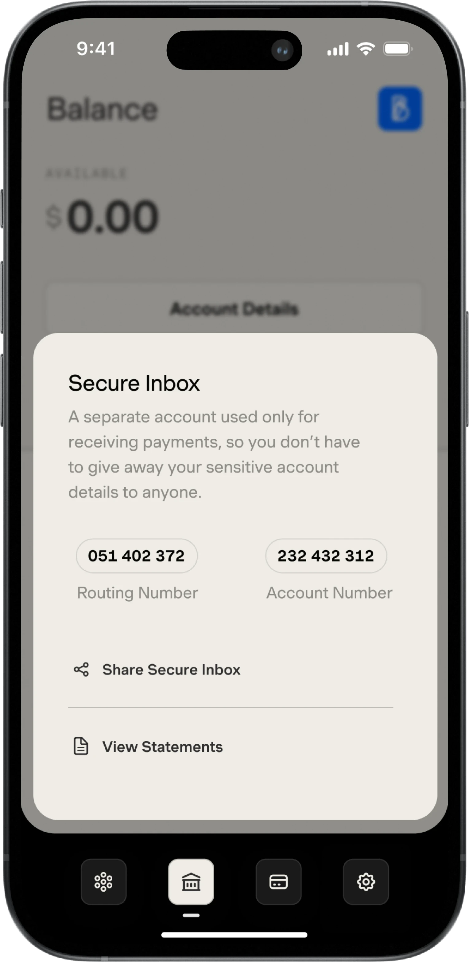
Secure Inbox
/ Capital / Product Design
Receive-only account details to secure checking account.
Problem
Founders frequently face the challenge of sharing their account details for business transactions, fundraising, and other financial activities. The prevalent method involves taking screenshots of account details and manually sending them to relevant parties. This approach is not only inefficient but also raises significant security concerns, as it exposes sensitive financial information in a potentially vulnerable manner. The lack of a streamlined, secure method for sharing account details has been a noticeable gap in the user experience on the Capital platform.
Solutions
To address this issue, we developed a dual-component feature: a secure method for sharing account details and a dedicated "Inbox" account for receiving payments. The new feature, integrated into the balance tab, allows founders to effortlessly and securely share their account details via email for various purposes, including receiving funds. The "Inbox" account, a novel addition to the platform, is specifically designed to segregate incoming payments from other account activities. This segregation not only enhances organizational efficiency but also adds an extra layer of security, giving users peace of mind when sharing their account details.
Results
The implementation of the "Secure Inbox" feature significantly enhanced the user experience on the Capital platform. Founders now benefit from a secure, efficient method of sharing account details, eliminating the need for manual, unsecured processes. The introduction of the "Inbox" account was particularly well-received, as it streamlined the process of managing incoming payments and improved overall financial organization.
Fundraising
Redesigned the Fundraising interface to support multiple SAFE terms concurrently, allowing for more flexibility in managing offerings and investor relations.
Fundraising
Redesigned the Fundraising interface to support multiple SAFE terms concurrently, allowing for more flexibility in managing offerings and investor relations.
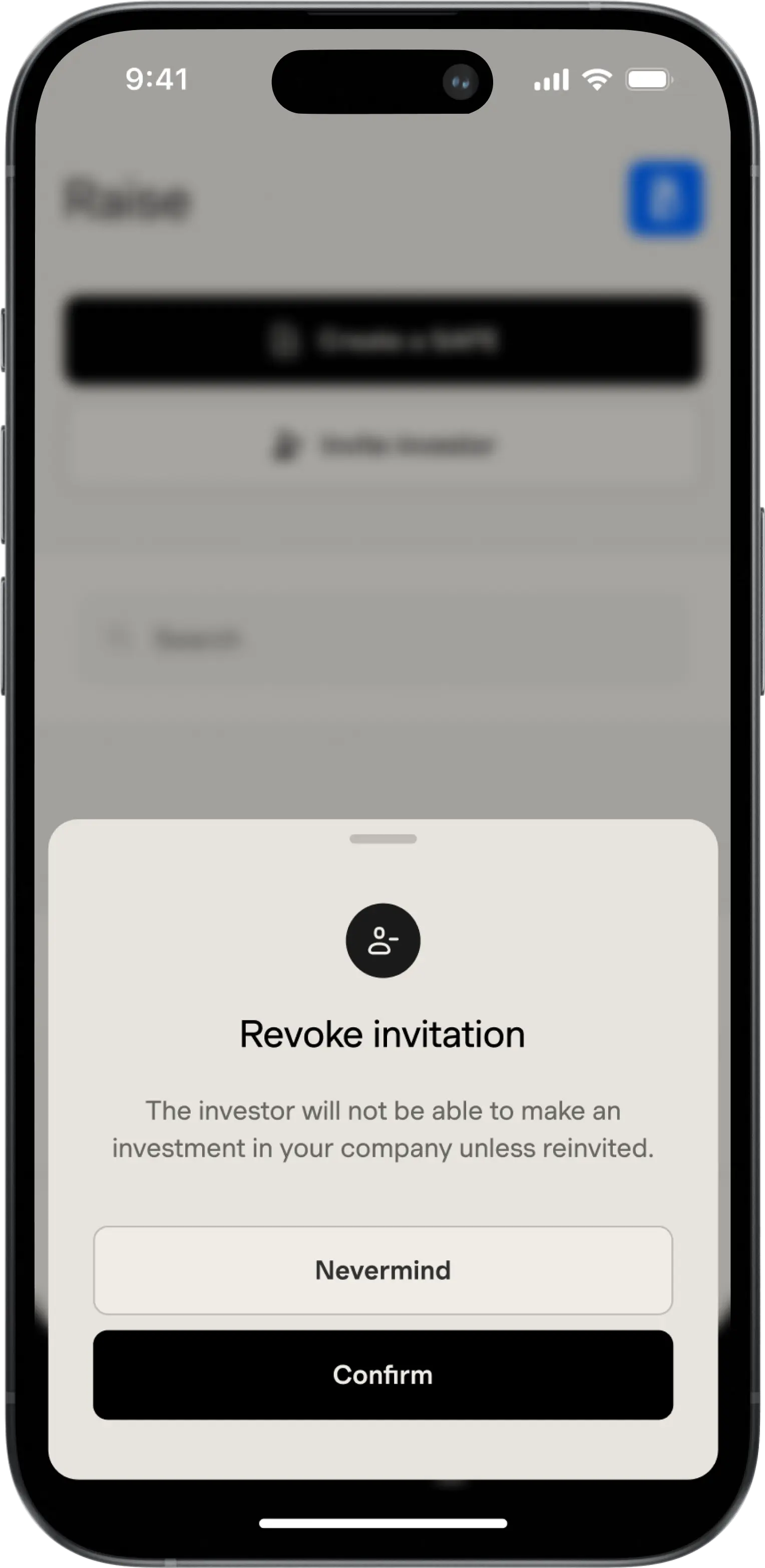
Revoke Invitation
/ Capital / Product Design
Bottom sheet modal for revoking investment invitation.
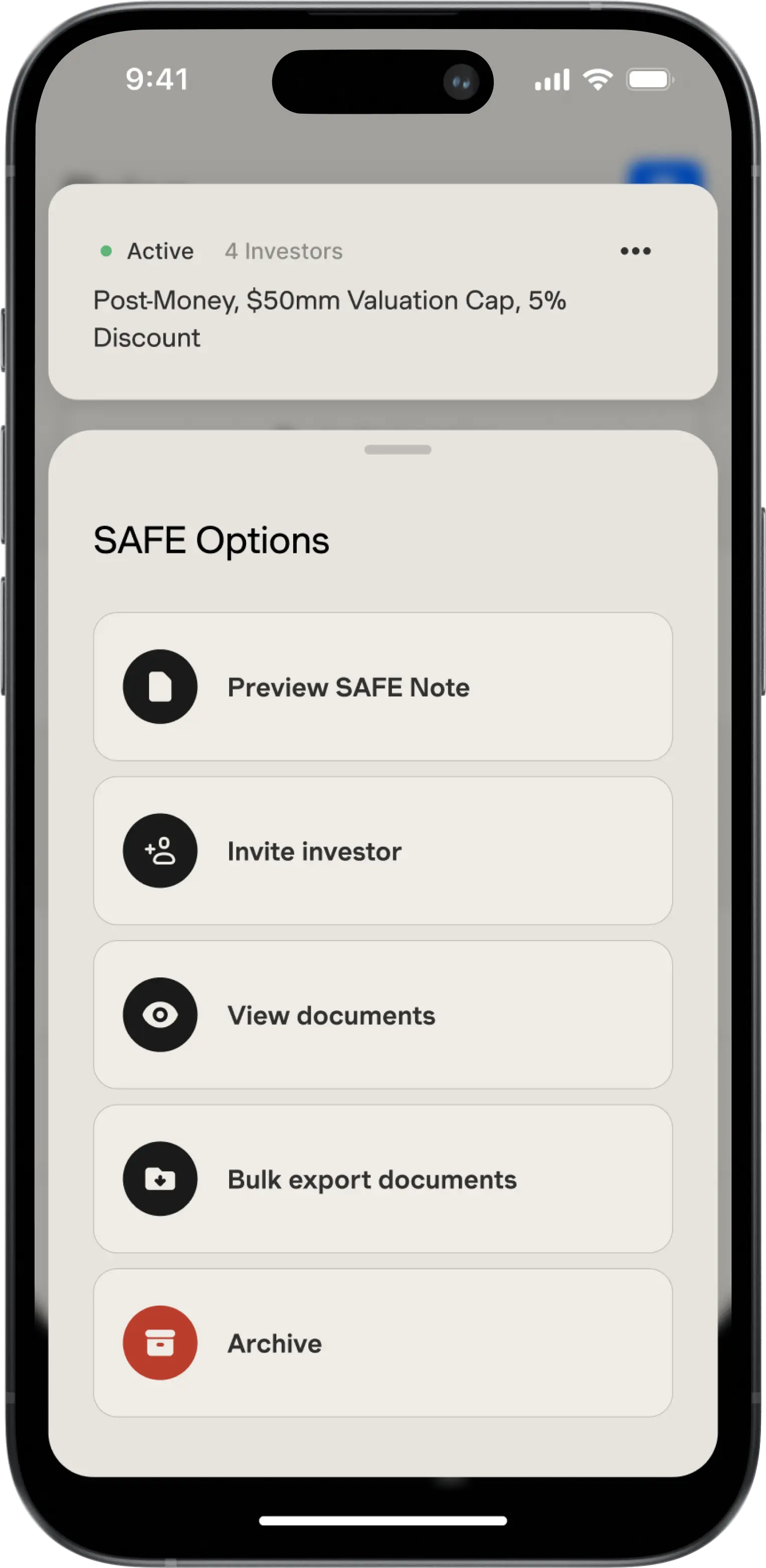
SAFE Options
/ Capital / Product Design
Modal for options related to SAFE.
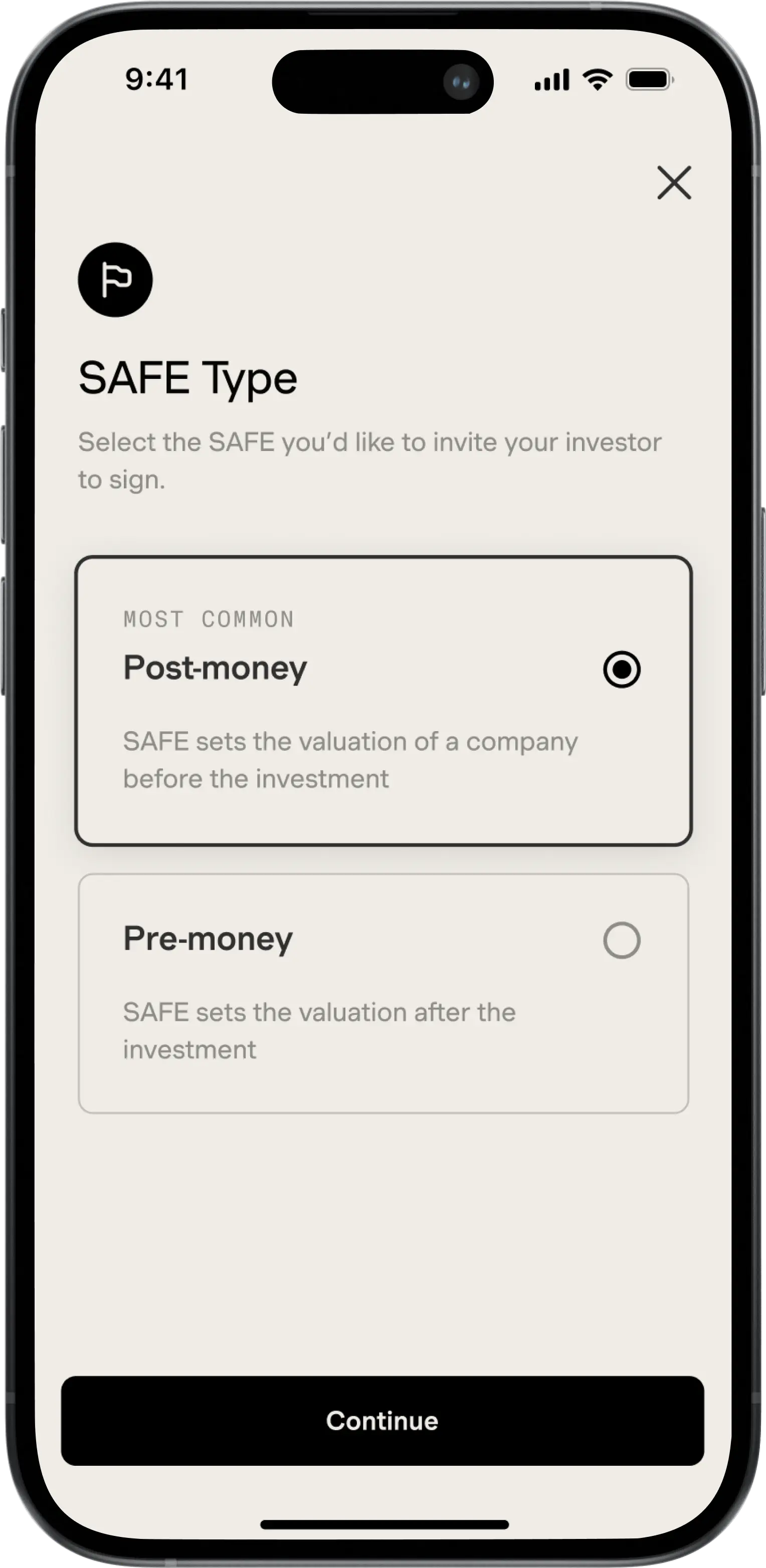
Choose SAFE Type
/ Capital / Product Design
In 'Generate SAFE' flow, choose SAFE type.
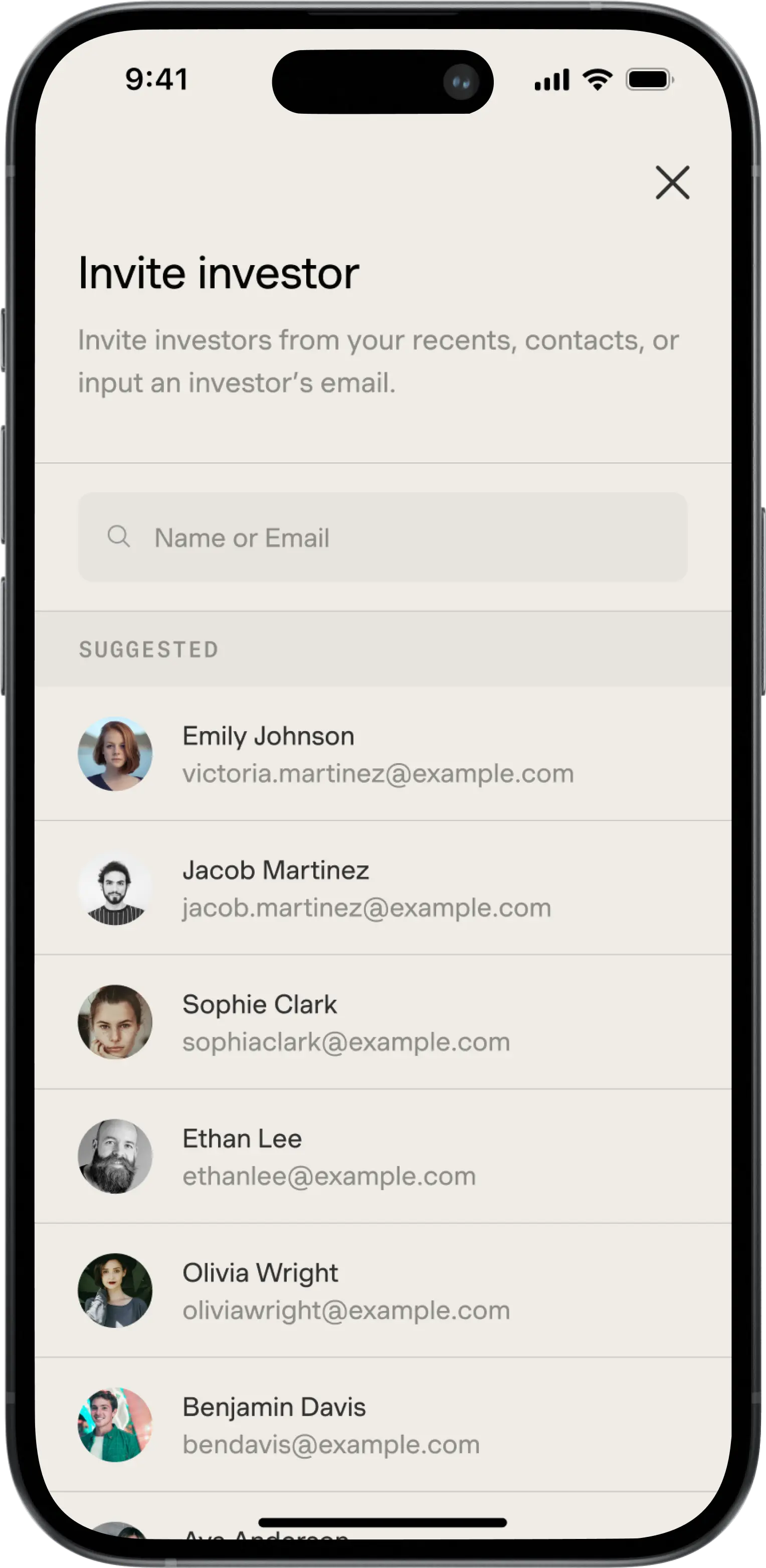
Invite Investor
/ Capital / Product Design
Invite investor from contacts or input email or phone number.
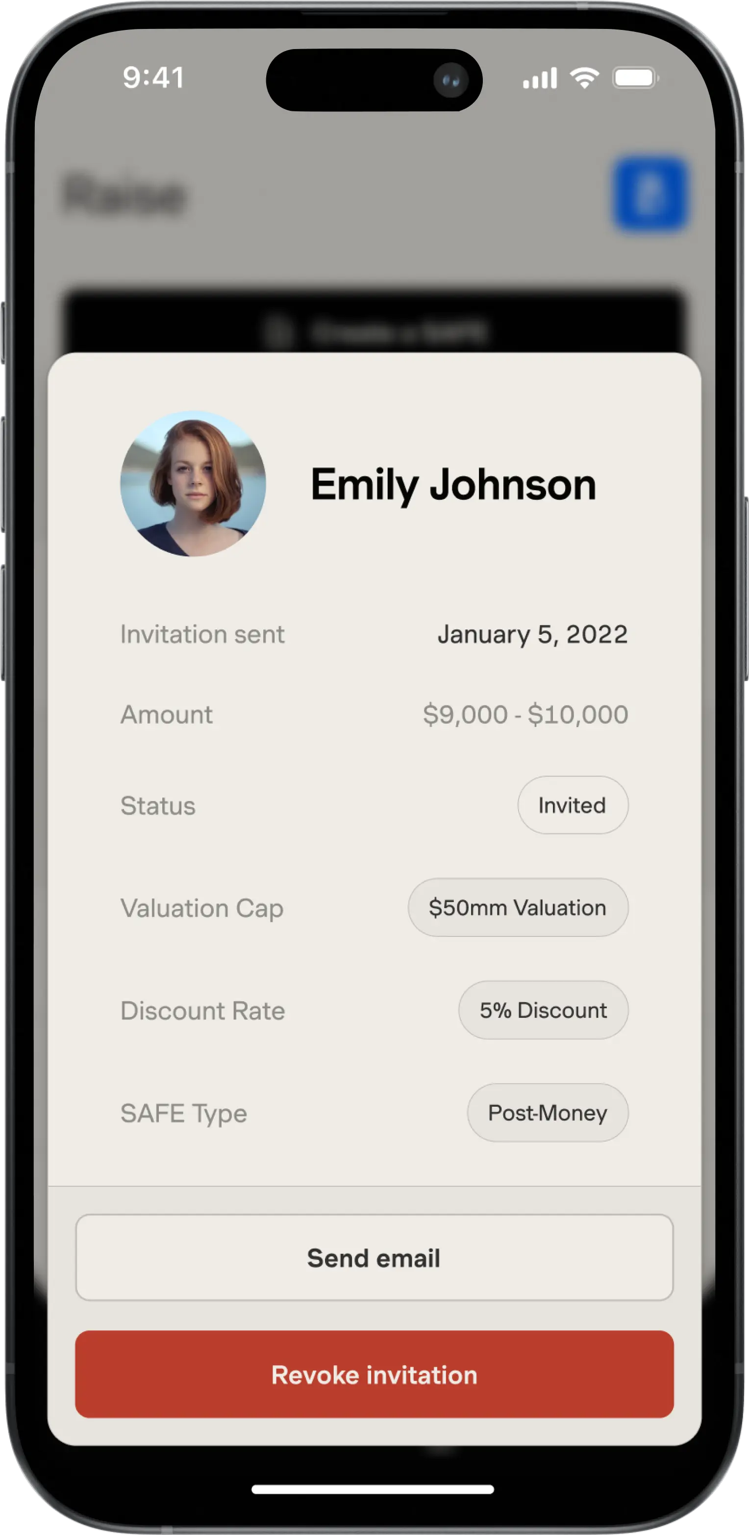
SAFE Invitiation
/ Capital / Product Design
Modal for viewing information and actions for investment.
Problem
In the realm of fundraising, founders using Capital's platform faced a significant limitation: the inability to offer varied terms to different investors within the same fundraising round. The existing system constrained founders to a single set of terms for all investors, leading to inefficiencies and complexities. To circumvent this, some founders resorted to creating duplicate offerings with different terms, a workaround that was neither efficient nor sustainable. This rigidity in the fundraising interface hindered the founders' ability to tailor their investment approaches and offer preferred terms to select investors, ultimately impacting the flexibility and effectiveness of their fundraising efforts.
Solutions
In response to this challenge, we embarked on a redesign of the Fundraising interface, focusing on the integration of multiple SAFE (Simple Agreement for Future Equity) terms within a single offering. This redevelopment allows founders to associate specific terms with individual investor invitations, providing the much-needed flexibility in managing varied investment conditions. To enhance usability, we ensured that the interface remained intuitive and organized, despite the increased complexity of handling multiple terms. The Fundraising dashboard was also upgraded to offer clear visibility of the terms agreed upon by each investor, thus improving the overall management and tracking of investor relations.
Results
The revamped Fundraising interface significantly improved the fundraising capabilities on the Capital platform. Founders can now efficiently manage multiple SAFE terms within a single offering, tailoring their approach to suit different investor preferences. The option to select from default, saved, or new terms when inviting investors has been particularly beneficial, offering unprecedented flexibility and control. The enhanced visibility of terms on the Fundraising dashboard has also been a key factor in simplifying investor management. This transformation has not only met the founders' requests for more adaptable fundraising tools but also elevated the overall efficiency and effectiveness of the fundraising process on Capital.
Cash App
Quickly send, receive, and invest money.
Cash App
Quickly send, receive, and invest money.
/ Summary
I designed a new financial service, a new flow for Cash Card issuance, a novel implementation of iOS Live Activities for support calls, and a widget for tracking transactions.
/ team
Executive stakeholders
Brian Grassadonia
Head of product & design
Dan Shin
Design
Dimitri Knight, Taylor Hunt
Design collaborators
Gustaf Engström, Liz So
/ Websites
Cash App
Support Live Activities
Providing users with real-time updates on pending support calls, enhancing communication and reducing uncertainty, tailored for a seamless and informed customer support experience.
Support Live Activities
Providing users with real-time updates on pending support calls, enhancing communication and reducing uncertainty, tailored for a seamless and informed customer support experience.
Support Live Activity
/ Cash App / Product Design
View status of upcoming support call.
Problem
Cash App users were facing a significant issue: the lack of real-time information regarding when a support agent would contact them. This absence of timely updates led to uncertainty and frustration among users, often resulting in missed calls and a degraded support experience. In an era where instant information is the norm, this gap in communication was a notable shortfall in Cash App's user experience, particularly during crucial support interactions.
Solutions
To address this challenge, we leveraged Apple's new Live Activities feature, designed for iPhone Lock Screens and specifically for iPhone 14 Pro models with Dynamic Island. This integration allowed for the creation of 'Support Live Activities,' a feature that provides users with a real-time progress bar and notifications about the timing of their pending support call. This feature was tailored to be easily accessible and visible directly from the iPhone Lock Screen, ensuring that users remain informed and prepared for the upcoming support interaction. The development focused on delivering concise, accurate updates, while maintaining compatibility across various iPhone models, thereby enhancing the support experience for a broad user base.
Results
Though existing as a hack-a-thon prototype, we imagine that the implementation of 'Support Live Activities' would significantly improve the user experience for Cash App customers seeking support. Users would benefit from real-time updates on their support call status, reducing the uncertainty and missed calls previously encountered. The feature's integration into the Lock Screen and Dynamic Island provided seamless, unobtrusive updates, aligning with users' expectations for modern, efficient communication. This enhancement would not only address a critical user need but also showcase Cash App's commitment to positive customer service interactions, thereby boosting overall customer satisfaction and trust in the platform.
Transactions Widget
Leveraging iOS16's home screen widget feature to provide underbanked users with real-time visibility of their checking account activities, enhancing financial management and convenience.
Transactions Widget
Leveraging iOS16's home screen widget feature to provide underbanked users with real-time visibility of their checking account activities, enhancing financial management and convenience.
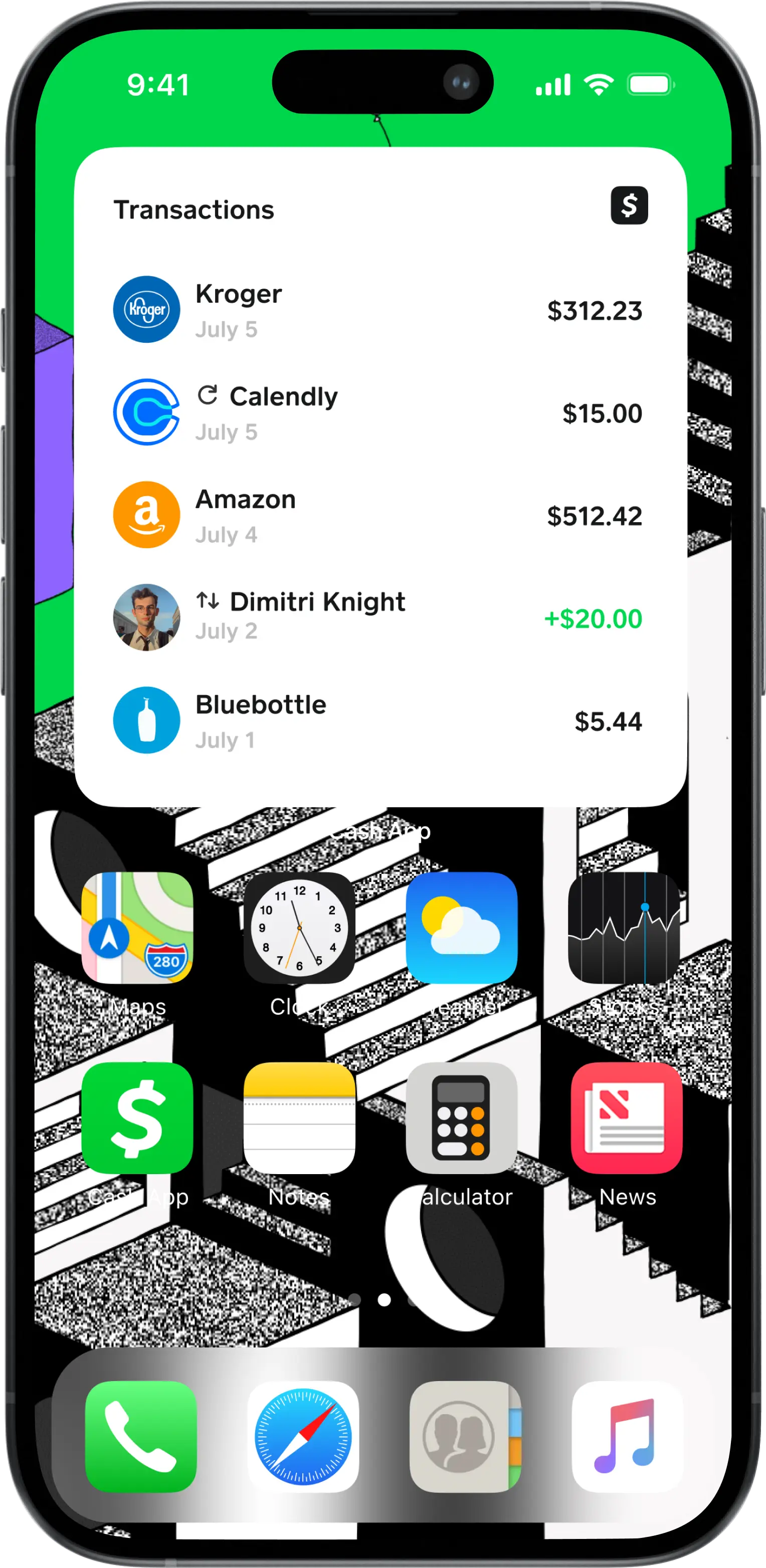
Transactions Widget
/ Cash App / Product Design
View transcations with tags for recurring or P2P transfer.
Problem
Underbanked Cash App users, who rely heavily on mobile banking, face significant challenges with the visibility of their checking account activities. This issue is particularly acute among younger users who prioritize the convenience of digital banking and need to track every dollar moving in and out of their accounts. The lack of real-time transaction information and efficient money management tools makes it difficult for these users to maintain a clear understanding of their financial status, leading to potential mismanagement of funds and financial uncertainty.
Solutions
To address this critical need, Cash App developed the 'Transactions Widget' for iPhone users, harnessing the power of iOS16's home screen widget feature. This widget provides a live view of users' checking accounts, displaying real-time information on money movement, Cash card payments, peer-to-peer transactions, and recurring payments. The design of the widget focuses on being visually appealing and space-efficient while ensuring compatibility across various iPhone models and iOS versions. By placing this widget on the iPhone home screen, Cash App enhances the visibility of financial activities for its users, offering valuable insights at a glance and significantly improving user engagement and convenience.
Results
This prototype existed within a group of widget explorations that overall markedly improved the financial oversight capabilities of our underbanked users. The recent release of the balance widget enabled Cash App users to have instant access to their Cash App balance directly from their iPhone home screens. Users have reported increased ease in tracking their finances, leading to better money management and a heightened sense of financial security. The widget's intuitive design and compatibility with multiple iPhone models have been praised for their user-centric approach. This innovation has not only elevated Cash App's utility for a crucial segment of its user base but also solidified its position as a leader in providing accessible, user-friendly digital banking solutions.
Cash Card Issuance
Revamping Cash App's Cash Card integrating elements like Card Studio and customizable shipping options, and addressing key pain points through clearer communication and flexible address options.
Cash Card Issuance
Revamping Cash App's Cash Card integrating elements like Card Studio and customizable shipping options, and addressing key pain points through clearer communication and flexible address options.
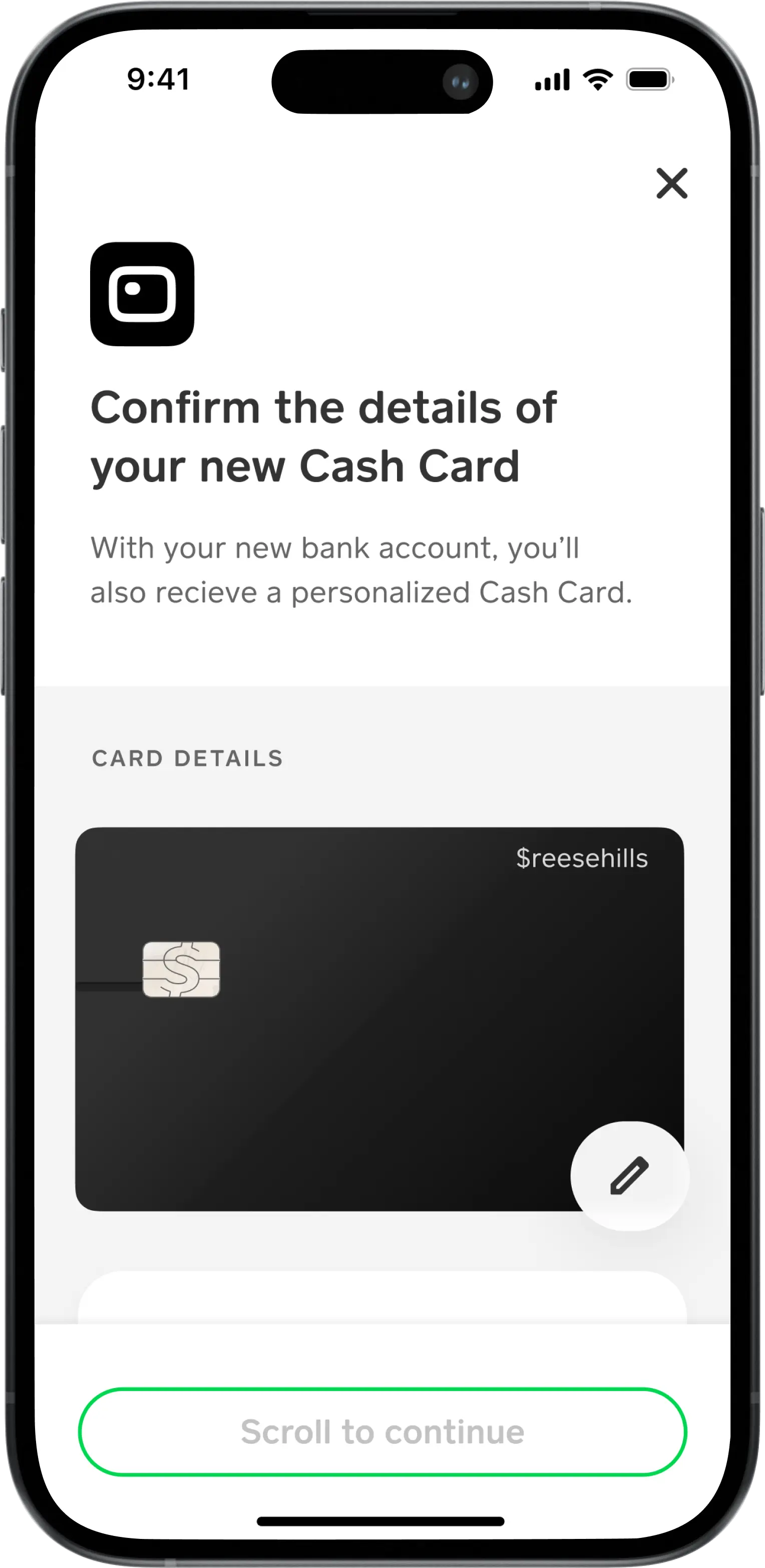
Cash Card Issuance
/ Cash App / Product Design
Confirm address and identity and accepts terms.
Problem
Cash App's Cash Card issuance process faced significant challenges in terms of consistency and user understanding. Users were often confused about the necessity and functionality of the Cash Card, and the existing design of the card issuance flow was not in line with Cash App’s overall design system. Key delightful features like the Card Studio were missing when the card issuance was incorporated into the broader financial service onboarding flows. Additionally, the lack of options for choosing shipping speeds and address flexibility added to user frustration, as many faced issues with tracking and remembering their shipment details.
Solutions
To enhance the user experience, we revamped the Cash Card issuance flow, integrating elements such as the Card Studio and options for shipping speed. We paid particular attention to the presentation of these elements, experimenting with different formats and levels of prominence to optimize the overall experience. Clearer, more informative copy was introduced to provide users with a better understanding of the card issuance process. A crucial addition was the feature allowing users to change their shipping address, addressing a common pain point identified through user research. This comprehensive redesign aimed at not only aligning the flow with Cash App’s design ethos but also at elevating the overall user experience by making the process more intuitive, customizable, and user-friendly.
Results
Though not yet implemented, we infer the reimagined Cash Card issuance process would significantly improve user engagement and satisfaction. We imagine the incorporation of the Card Studio and shipping options would be well-received, with users appreciating the enhanced customization and control over their card issuance experience. The new, clearer copy would successfully resolve much of the confusion around the Cash Card, its benefits, and its functionality. The ability to change the shipping address would be a particularly notable improvement, addressing a key user concern and reducing issues related to card delivery. This overhaul would not only bring the card issuance process in line with Cash App’s design system but also provide a more delightful, seamless experience for users, reinforcing Cash App's commitment to creating a delightful, intuitive banking experience.
Visible
Revolutionizing the way we buy, sell, and own property.
Visible
Revolutionizing the way we buy, sell, and own property.
/ Summary
As design lead of Visible's Admin Dashboard, I created a platform for administrators and support agents to manage user accounts and their respective properties. The dashboard includes advanced search capabilities, comprehensive user account views, and tools for verifying property ownership, managing identity verification, as well as verifying and manually editing property title details. I took special care into integrating the dashboard with essential third-party services like Gladly, Persona, and Etherscan enhancing an admin's workflow in managing tickets, verifying user identity, and tracking blockchain transactions.
My efforts were particularly concentrated on the admin's ability to manually verify user identity, property title matching. This work significantly improved the user support experience, streamlined account management processes, and bolstered admin's ability to maintain valid user and property records.
Admin Dashboard
Enhanced user account management and support, creating a platform to manage support tickets, take actions on account, manually adjust user information and property information, and properly integrating third party platforms like Persona for IDV and Gladly for customer support.
Admin Dashboard
Enhanced user account management and support, creating a platform to manage support tickets, take actions on account, manually adjust user information and property information, and properly integrating third party platforms like Persona for IDV and Gladly for customer support.
Sign In
/ Visible / Product Design
Admin sign in page for accessing dashboard. Use email and password or SSO with Google.
Sign In
/ Visible / Product Design
Admin sign in page for accessing dashboard. Use email and password or SSO with Google.
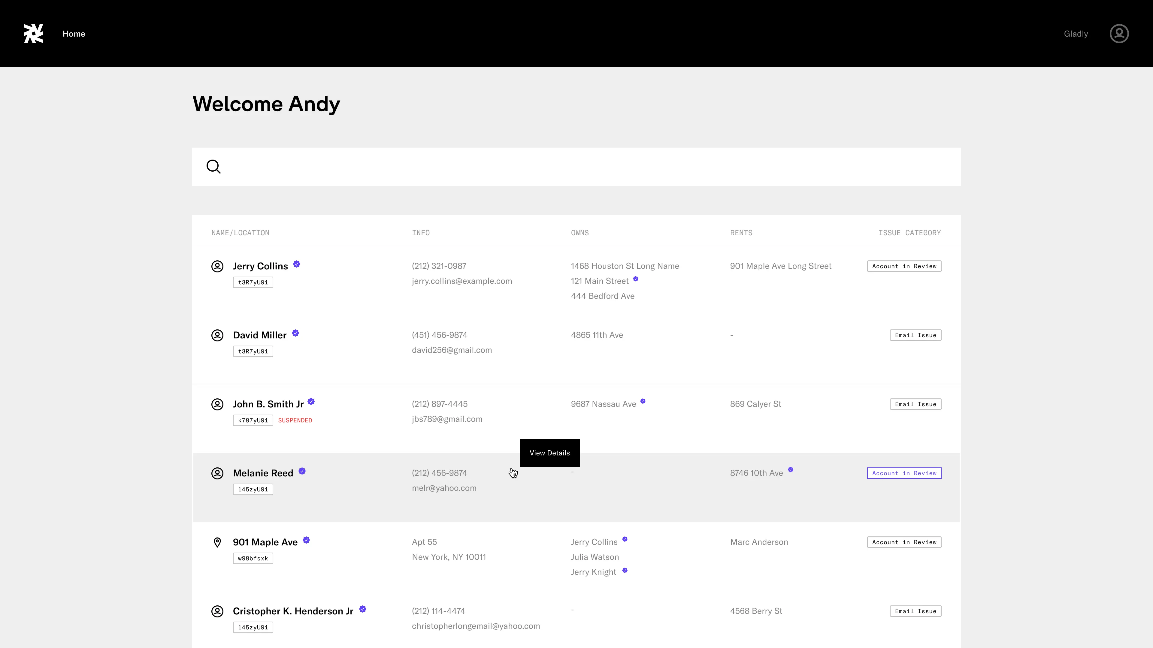
Search
/ Visible / Product Design
View user-generated tickets and their respective name or location, information, ownership, rentership, and issue categories.
Search
/ Visible / Product Design
View user-generated tickets and their respective name or location, information, ownership, rentership, and issue categories.
User Page, Account
/ Visible / Product Design
View and edit user profile and contact information.
User Page, Account
/ Visible / Product Design
View and edit user profile and contact information.
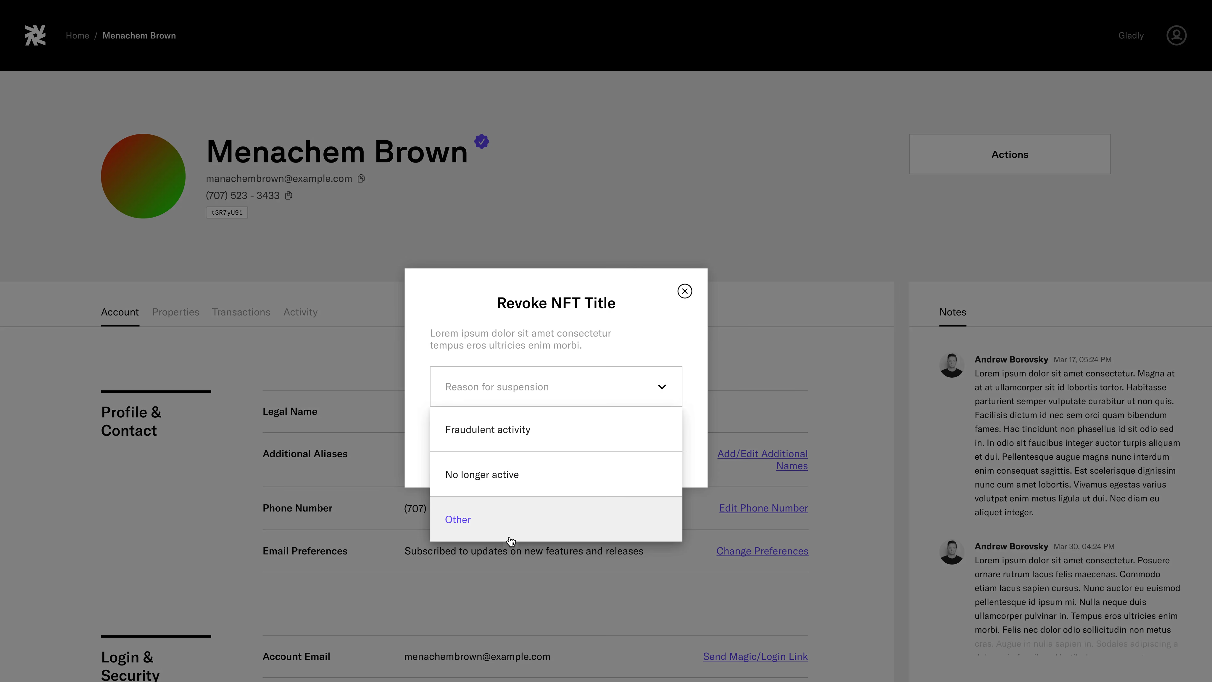
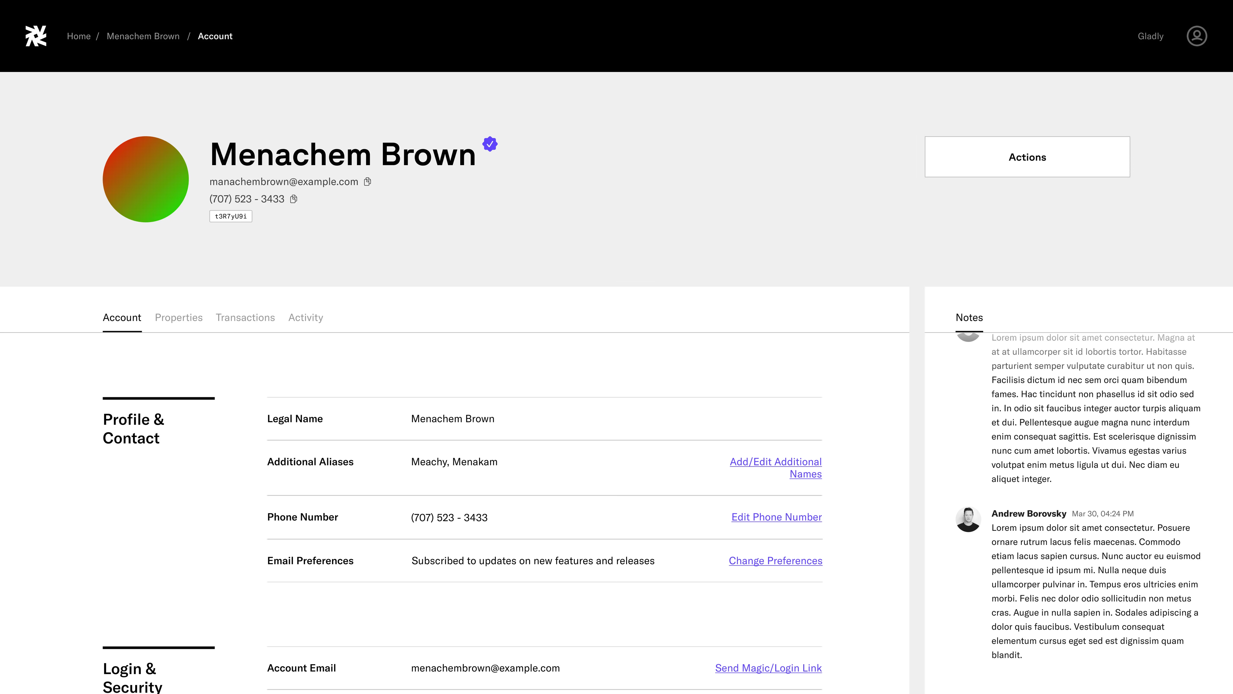
User Page, Revoke NFT Modal
/ Visible / Product Design
Modal for revoking Visible-issued NFT property title.
User Page, Revoke NFT Modal
/ Visible / Product Design
Modal for revoking Visible-issued NFT property title.
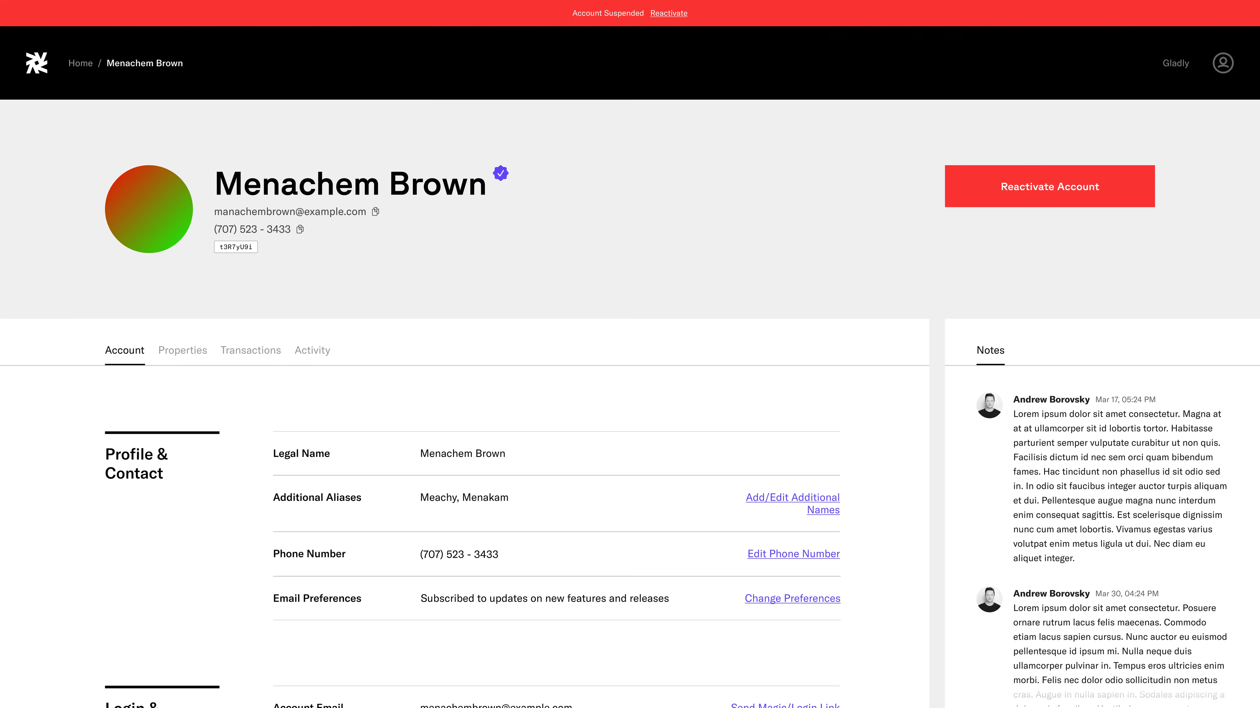
User Page, Suspended
/ Visible / Product Design
View suspended user account.
User Page, Suspended
/ Visible / Product Design
View suspended user account.
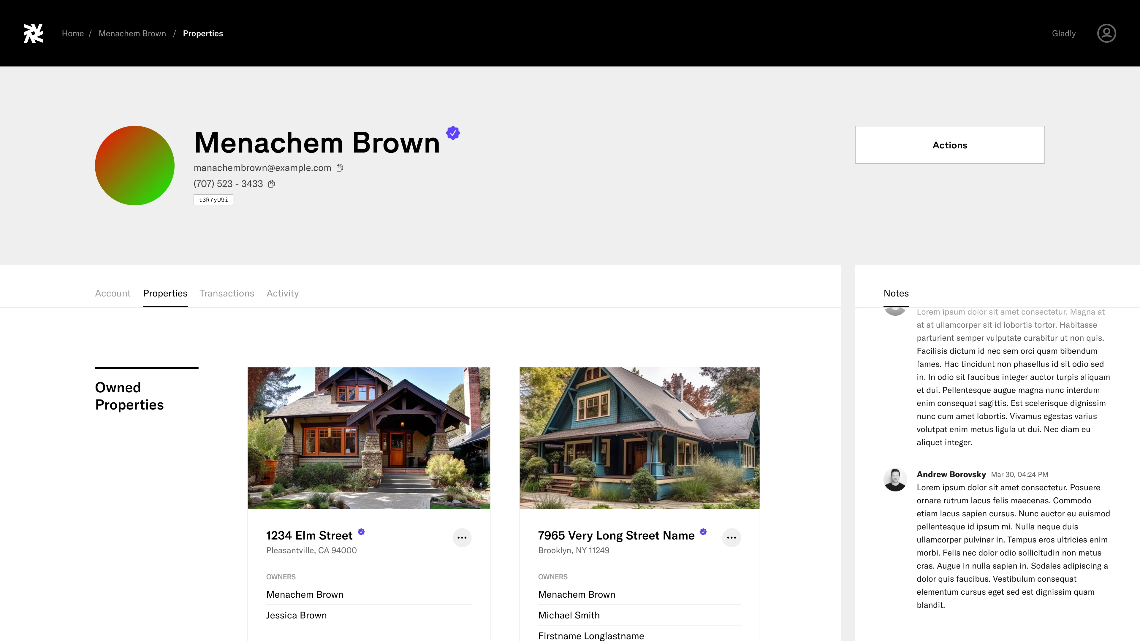
User Page, Properties
/ Visible / Product Design
View owned and rent properties.
User Page, Properties
/ Visible / Product Design
View owned and rent properties.
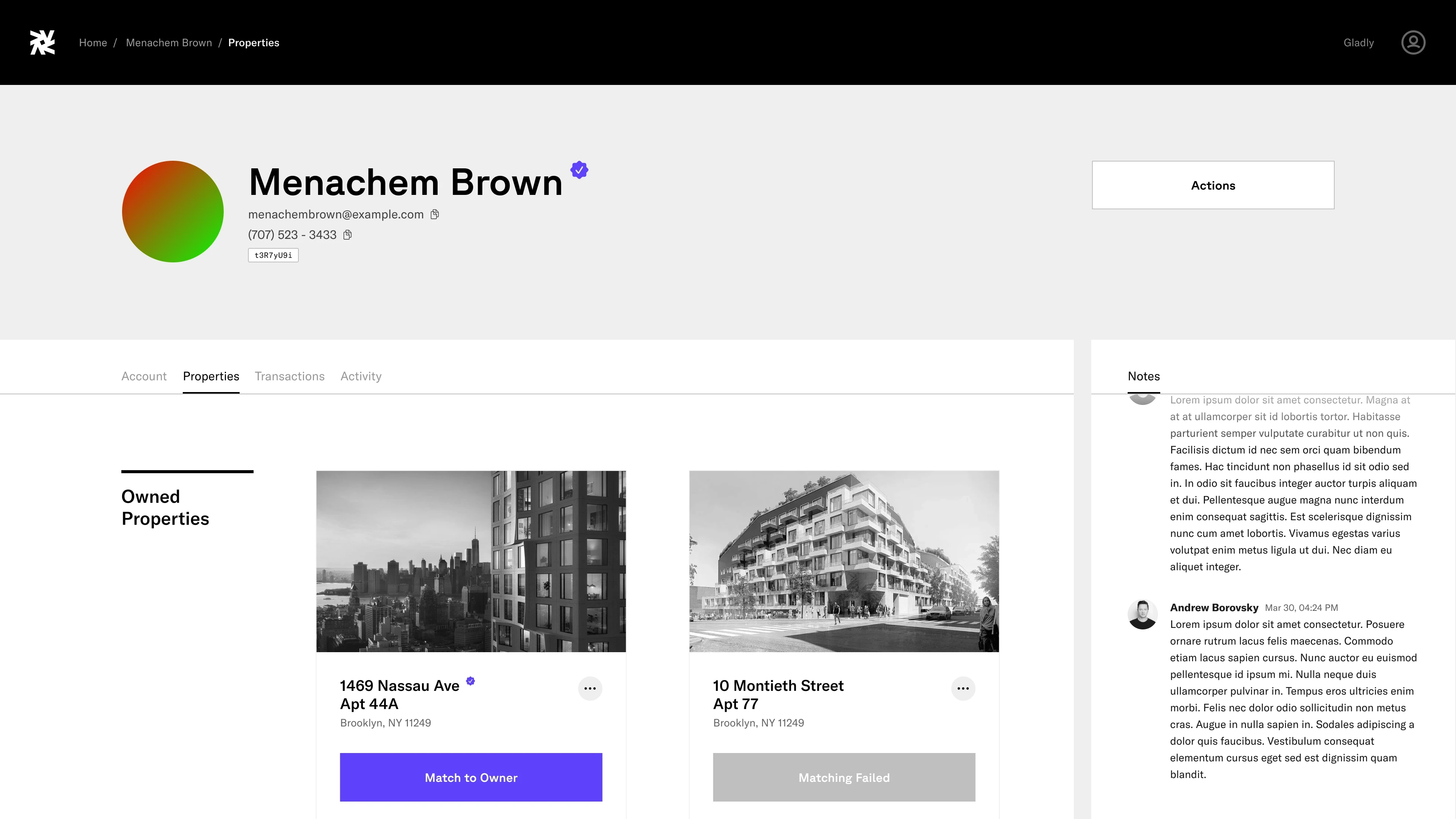
User Page, Properties (Unmatched)
/ Visible / Product Design
View claimed but unmatched properties.
User Page, Properties (Unmatched)
/ Visible / Product Design
View claimed but unmatched properties.
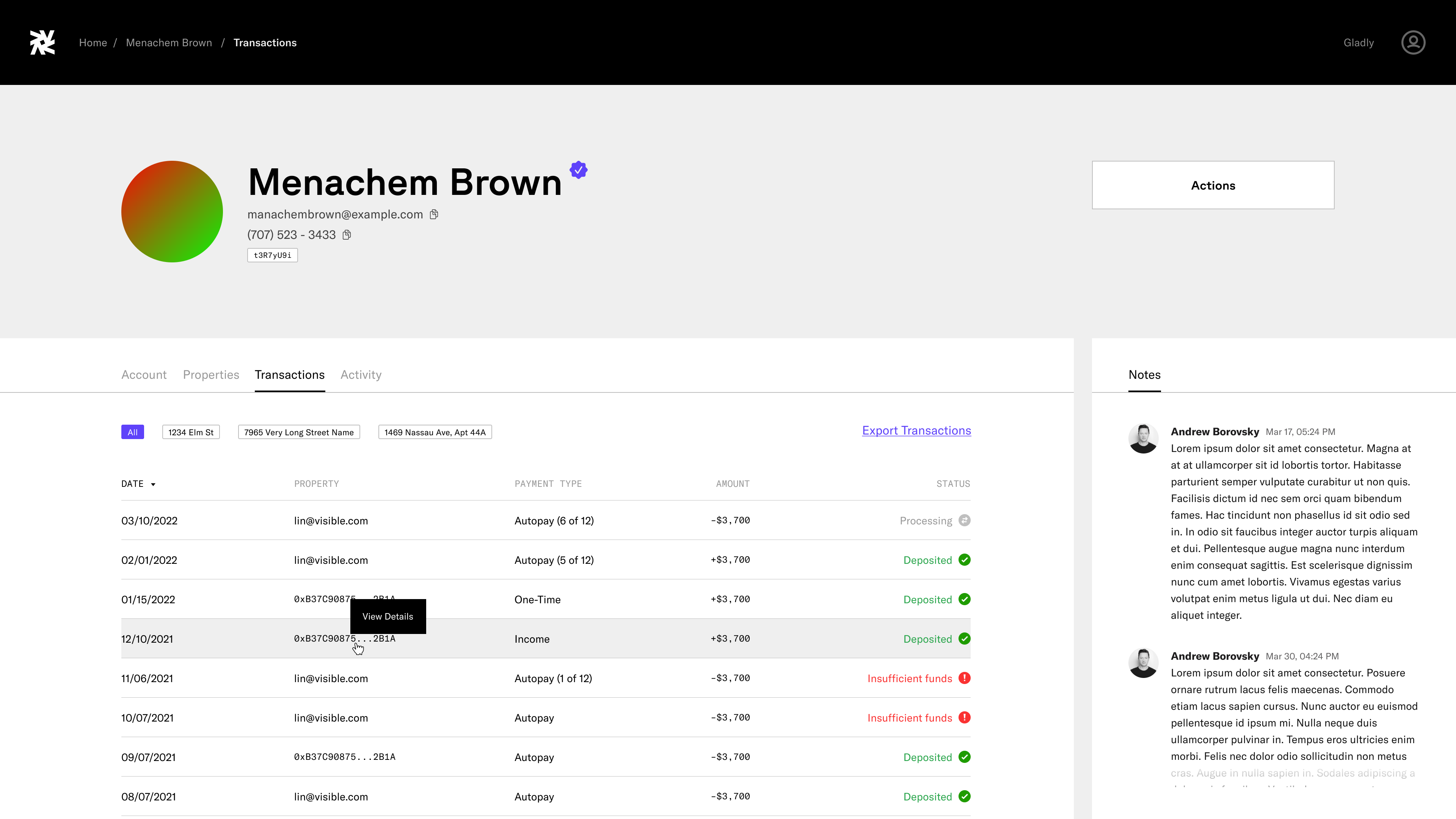
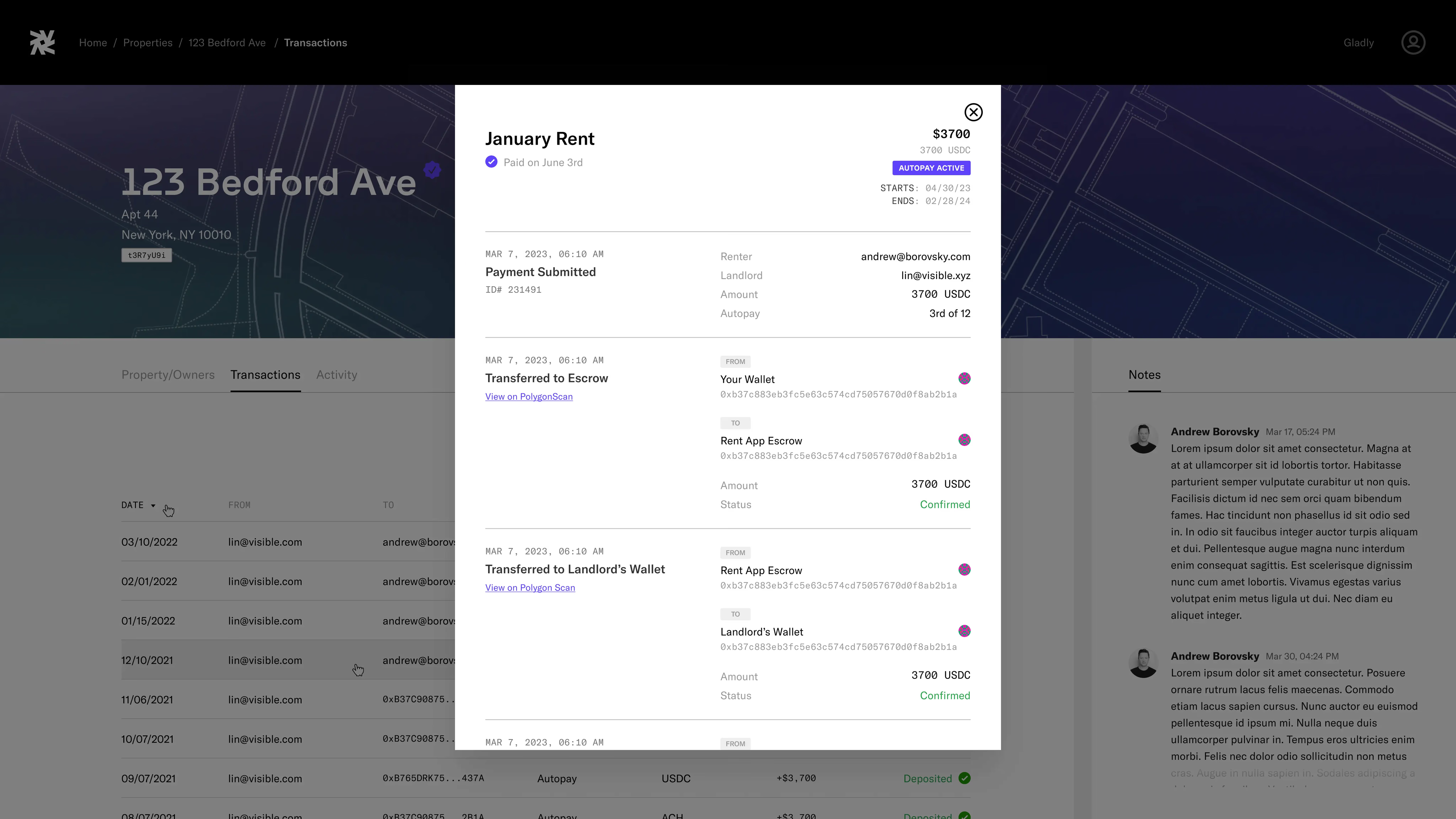
User Page, Transaction
/ Visible / Product Design
View and filter transactions of rent payments.
User Page, Transaction
/ Visible / Product Design
View and filter transactions of rent payments.
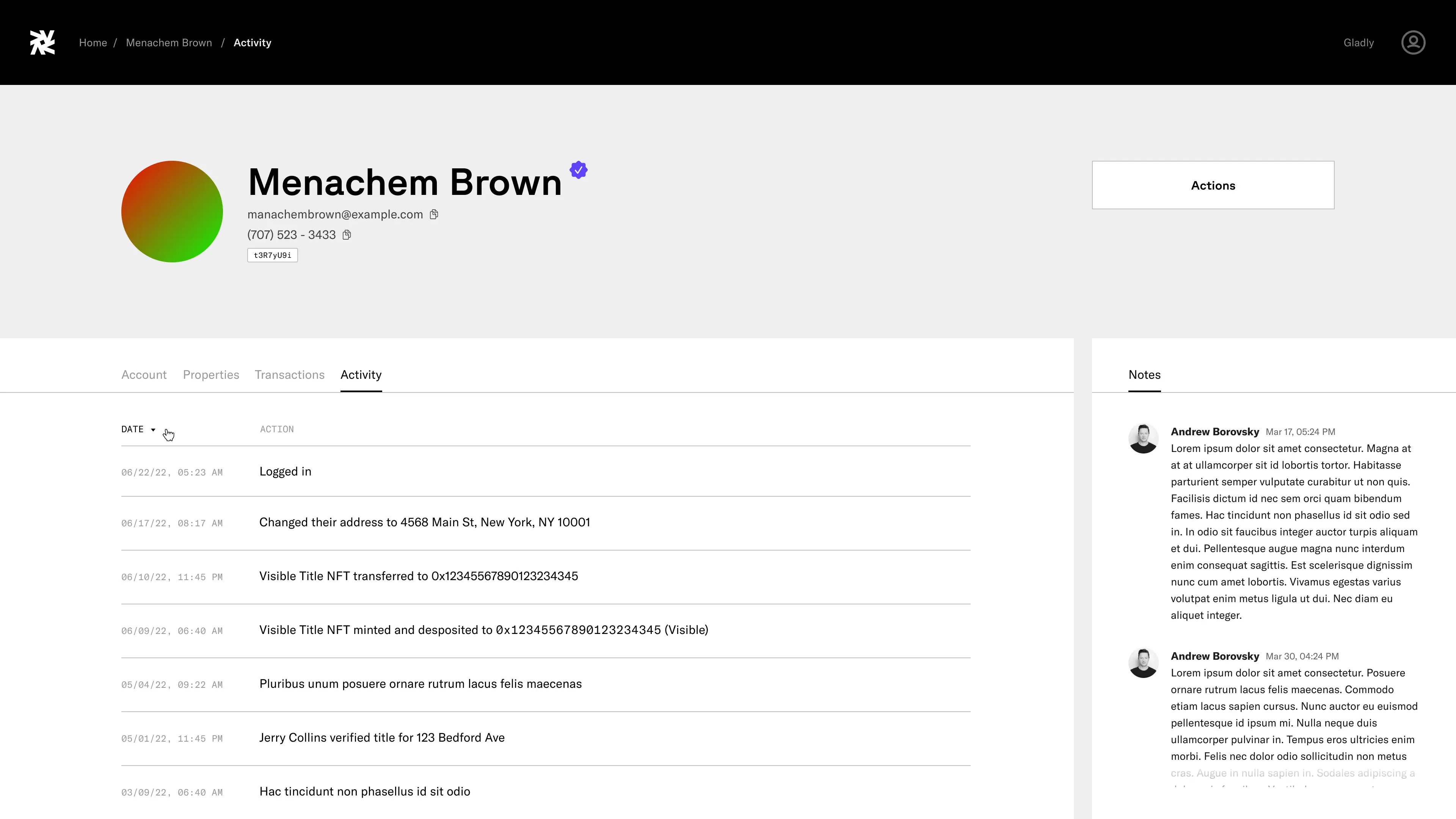
User Page, Activity
/ Visible / Product Design
View user activity with description, date, and time.
User Page, Activity
/ Visible / Product Design
View user activity with description, date, and time.
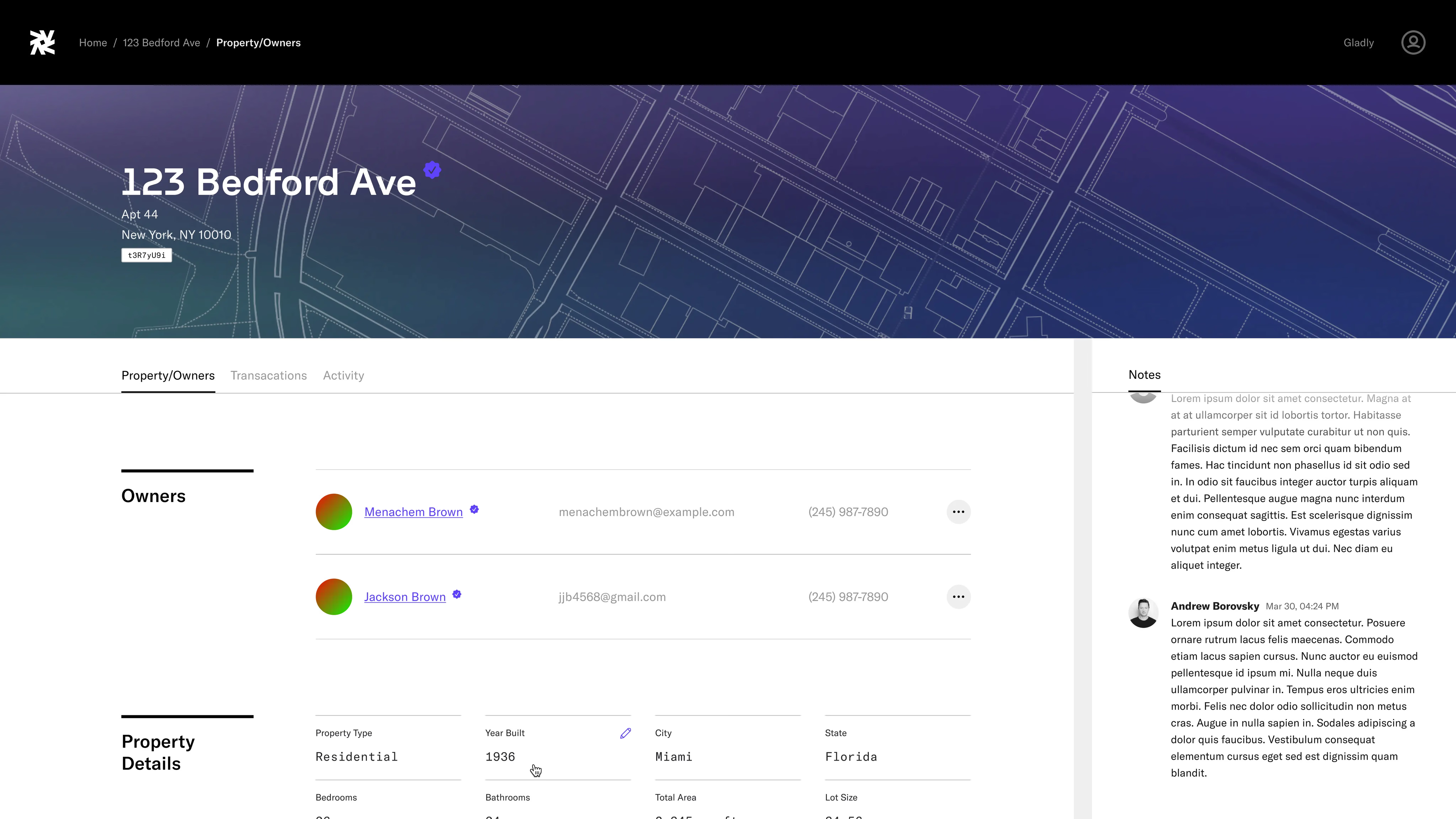
Properties
/ Visible / Product Design
View property's owners and property title details.
Properties
/ Visible / Product Design
View property's owners and property title details.
Properties, Transaction Modal
/ Visible / Product Design
View receipt of rent payment.
Properties, Transaction Modal
/ Visible / Product Design
View receipt of rent payment.
Problem
Visible faced a unique challenge in managing complex user support and account administration within their real estate financial network. The task was to develop a comprehensive Admin Dashboard capable of not only handling support tickets and user account adjustments but also integrating third-party platforms like Persona for identity verification (IDV) and Gladly for customer support. The underlying question was how to create a unified system that could efficiently manage user and property information while ensuring seamless integration with essential external services.
Solutions
We developed a comprehensive Admin Dashboard, streamlining user account management and support. It involved creating a robust platform capable of efficiently managing support tickets and facilitating important account actions on user accounts. We enabled manual adjustments to user information and property details, ensuring accuracy and flexibility in data management also allowing us to refine our third-party vendor's data. A critical aspect of our approach was the seamless integration of third-party platforms — incorporating Persona for reliable identity verification and Gladly for customer support, enhancing the dashboard's functionality and simplifying admin's workstream. The design of the dashboard struck a balance between sophisticated capabilities and ease of use, aiming to optimize administrative efficiency.
Results
The launch of Visible's Admin Dashboard significantly improved the efficiency and accuracy of user account management and support. The integration of Persona and Gladly allowed for a streamlined admin experience, wtih the enhanced support ticket system leading to faster resolution times. The dashboard has become an essential tool in Visible's operations.
Rent App
Designed various parts of Rent App, a Visible product which makes paying rent easy and safe, being safer than wires, faster than checks, and also helping renters build credit by reporting on-time payments to the three credit bureaus.
Rent App
Designed various parts of Rent App, a Visible product which makes paying rent easy and safe, being safer than wires, faster than checks, and also helping renters build credit by reporting on-time payments to the three credit bureaus.
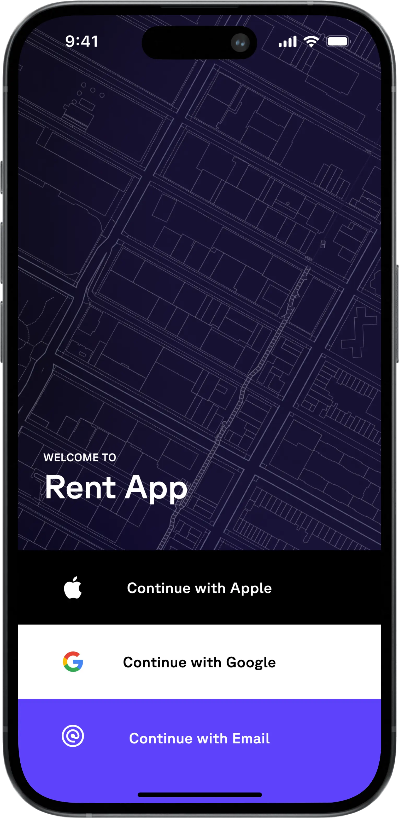
Sign In
/ Visible / Product Design
Sign in page for iOS with email, Google SSO, and Apple SSO.
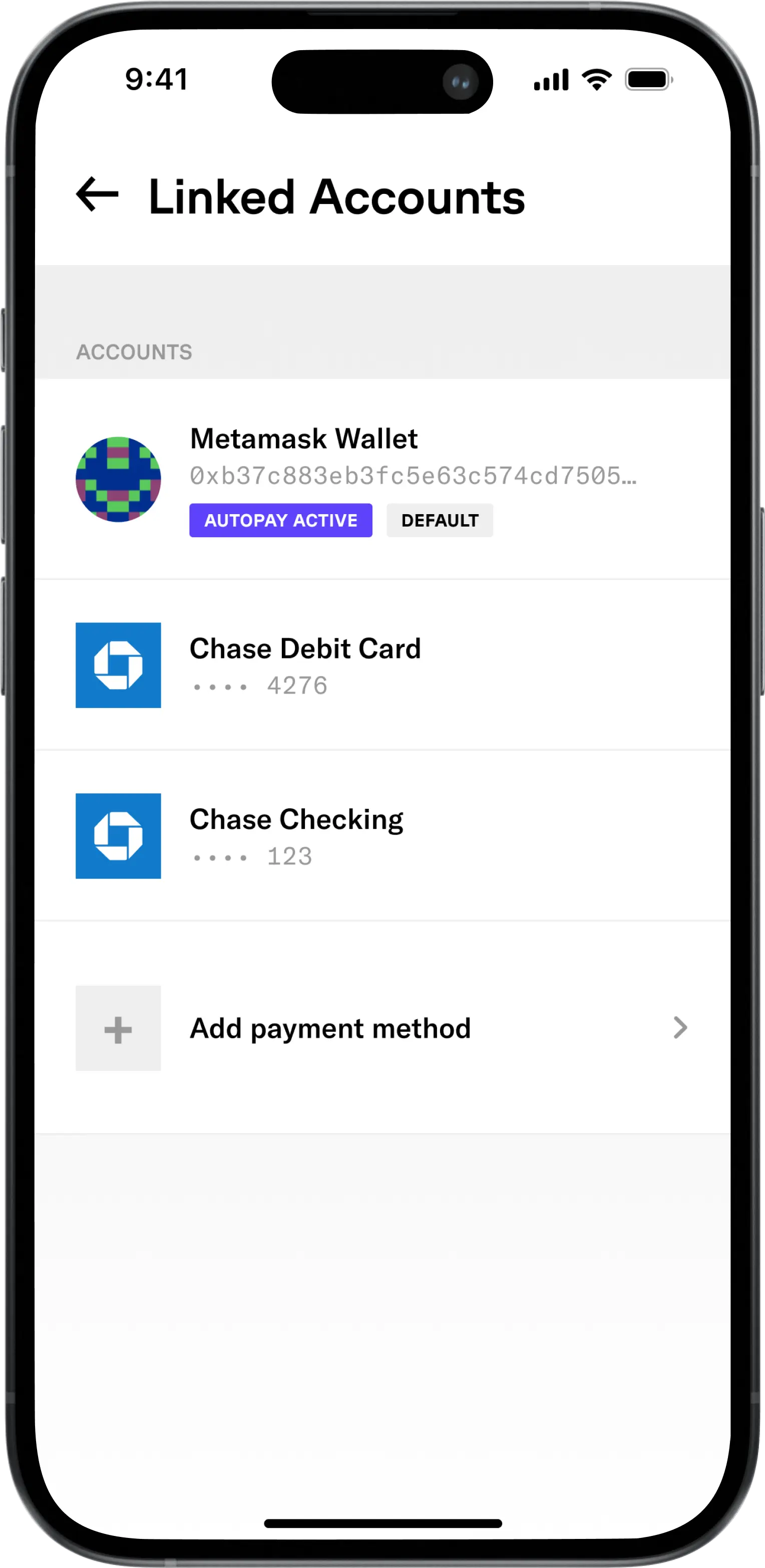
Linked Accounts
/ Visible / Product Designany / Skill
Viewed linked checking accounts and wallets.
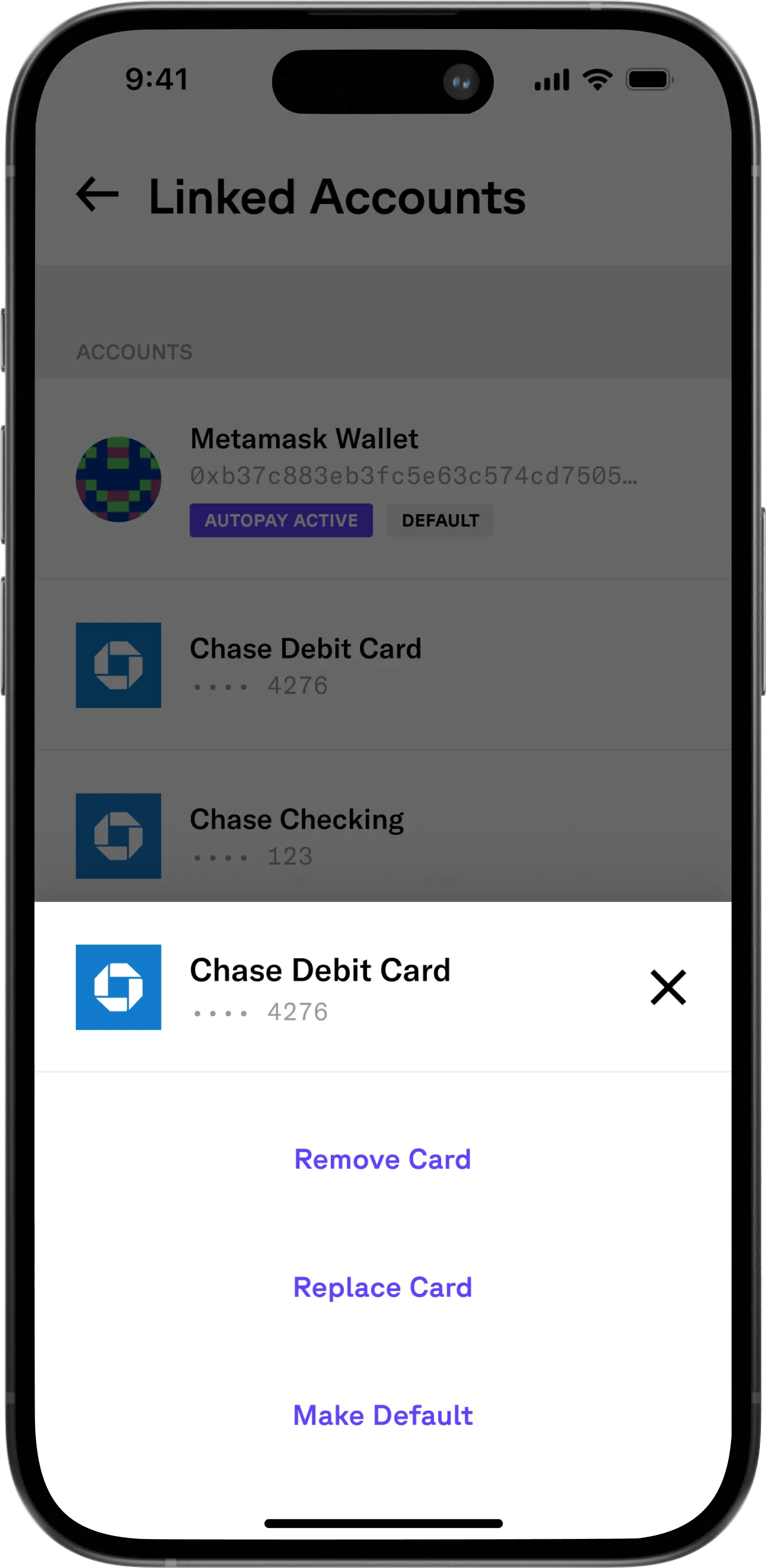
Linked Accounts, Bottom Sheet
/ Visible / Product Design
Take actions on linked checking account.
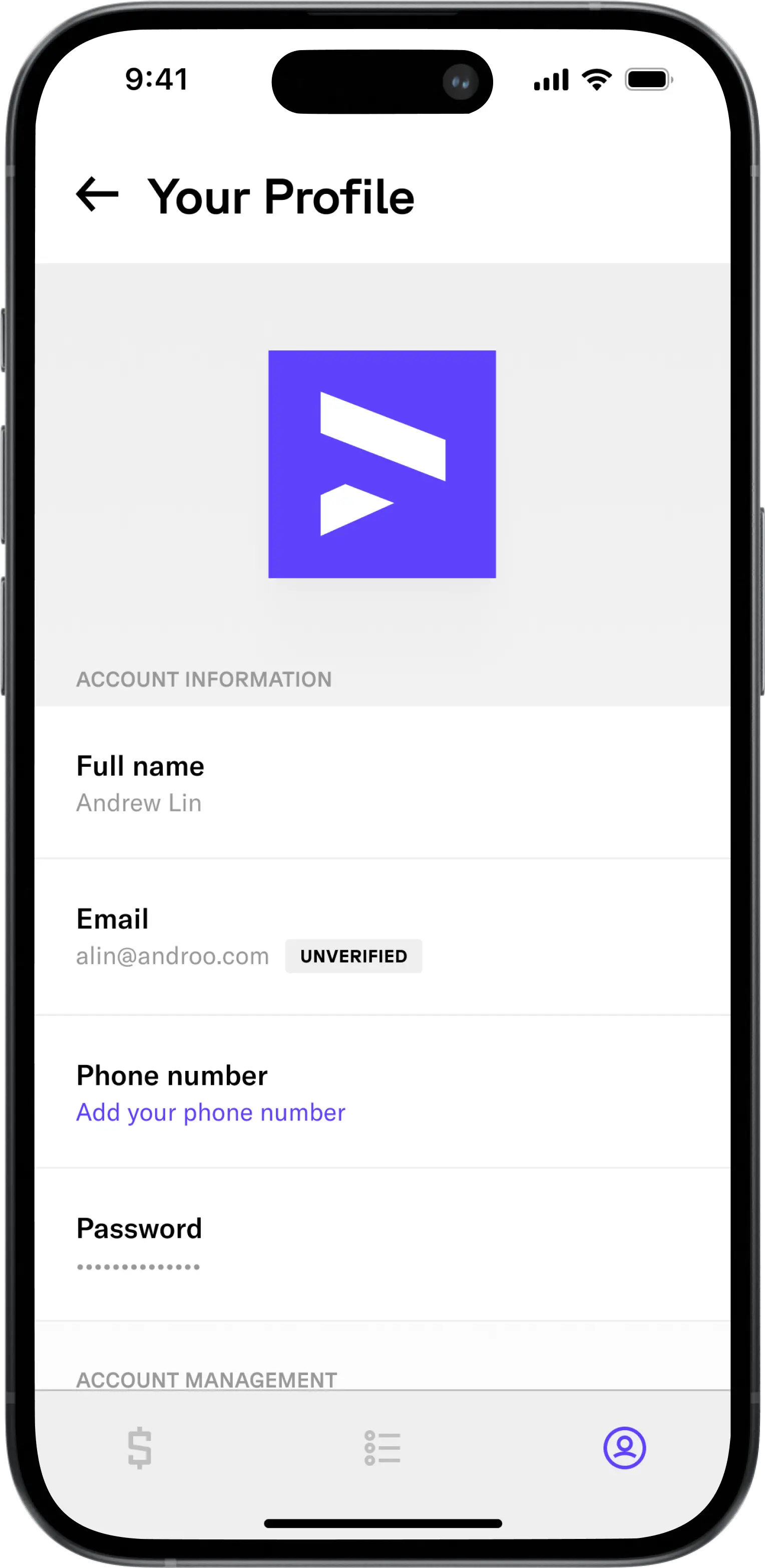
Your Profile
/ Visible / Product Design
View account information and manage account.
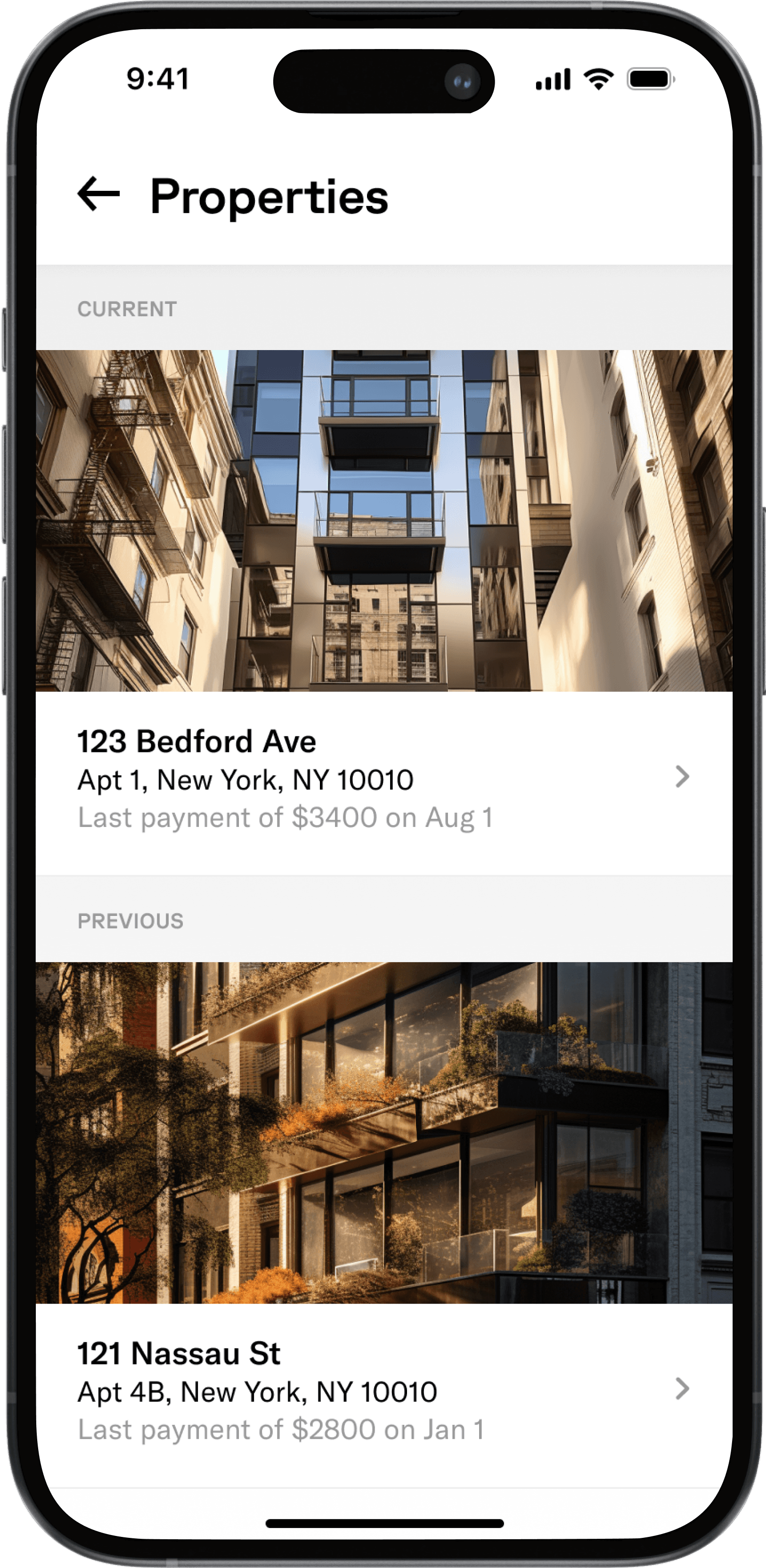
Properties
/ Visible / Product Design
View your owned and rented properties.
Problem
The traditional rent payment landscape was fraught with inefficiencies and risks, such as the slow processing of checks and the security concerns of wire transfers. Renters faced the additional challenge of their timely payments not contributing to their credit history, a critical factor in future homeownership opportunities. Visible recognized these issues and sought to revolutionize this process with the Rent App. The challenge was to design an application that not only simplified the payment process but also provided additional financial benefits to renters, all within a secure and user-friendly interface.
Solutions
I designed the login interface, allowing users to log in with SSO For account management, I designed screens that allowed users to view and manage their linked debit cards, crypto wallets, and bank accounts connected via Plaid or Metamask. This included options to remove, replace, or set a default payment method, addressing users' needs for flexibility in payment options. Additionally, I designed the tabs for viewing current and previously rented properties, enabling users to easily track and manage their rental history.
Delphi
Build the AI version of you.
Delphi
Build the AI version of you.
/ Summary
As the designer behind Delphi's brand identity, art direction, and design system, I explored how the world should imagine human-AI interaction. To bring this vision to life, I enlisted the help of Midjourney, allowing me to generate an elegant, surreal aesthetic that spoke to Delphi's brand values and mission, transforming a tech product into a cinematic experience.
As part of my work with Delphi, I designed key flows for their web product, including onboarding to guide new users through clone creation, and Clone Studio, a dashboard for tracking clone performance and usage analytics, allowing one to take actions to review and improve clone.
/ team
Executive stakeholders
Dara Ladajevardian, Sam Spelsberg
Design
Dimitri Knight
Design collaborators
Eliz Akgün
/ Websites
Delphi
Branding
Created logo, branding package, and art direction for Delphi's fictional universe.
Branding
Created logo, branding package, and art direction for Delphi's fictional universe.
Logomark
/ Delphi / Branding
Logo inspired by Delphic Episilon and unzipped DNA.

Albert Einstein
/ Delphi / Art Direction
Einstein seen through The Portal

The Portal
/ Delphi / Art Direction
Reaching through The Portal.

The Chamber
/ Company / Skill
Woman's reflection in a The Chamber's mirror maze, creating a surreal and infinite effect, with a neon-lit aesthetic.

Warren Buffett
/ Delphi / Art Direction
"Wes Anderson-esque" Buffett in The World

Fredrich Nietzche
/ Delphi / Art Direction
"Wes Anderson-esque" Nietzche in The World

Amaranth
/ Delphi / Art Direction
The flower of immortality.
Waitlist
Designed waitlist page and collateral for announcing Delphi's seed round.
Waitlist
Designed waitlist page and collateral for announcing Delphi's seed round.

Waitlist
/ Delphi / Product Design & Art Direction
Landing page for Delphi's fundraising announcement.
Waitlist
/ Delphi / Product Design & Art Direction
Landing page for Delphi's fundraising announcement.
Onboarding
Designed the sign in page and onboarding for digital clone setup, training, andjustments, and review.
Onboarding
Designed the sign in page and onboarding for digital clone setup, training, andjustments, and review.
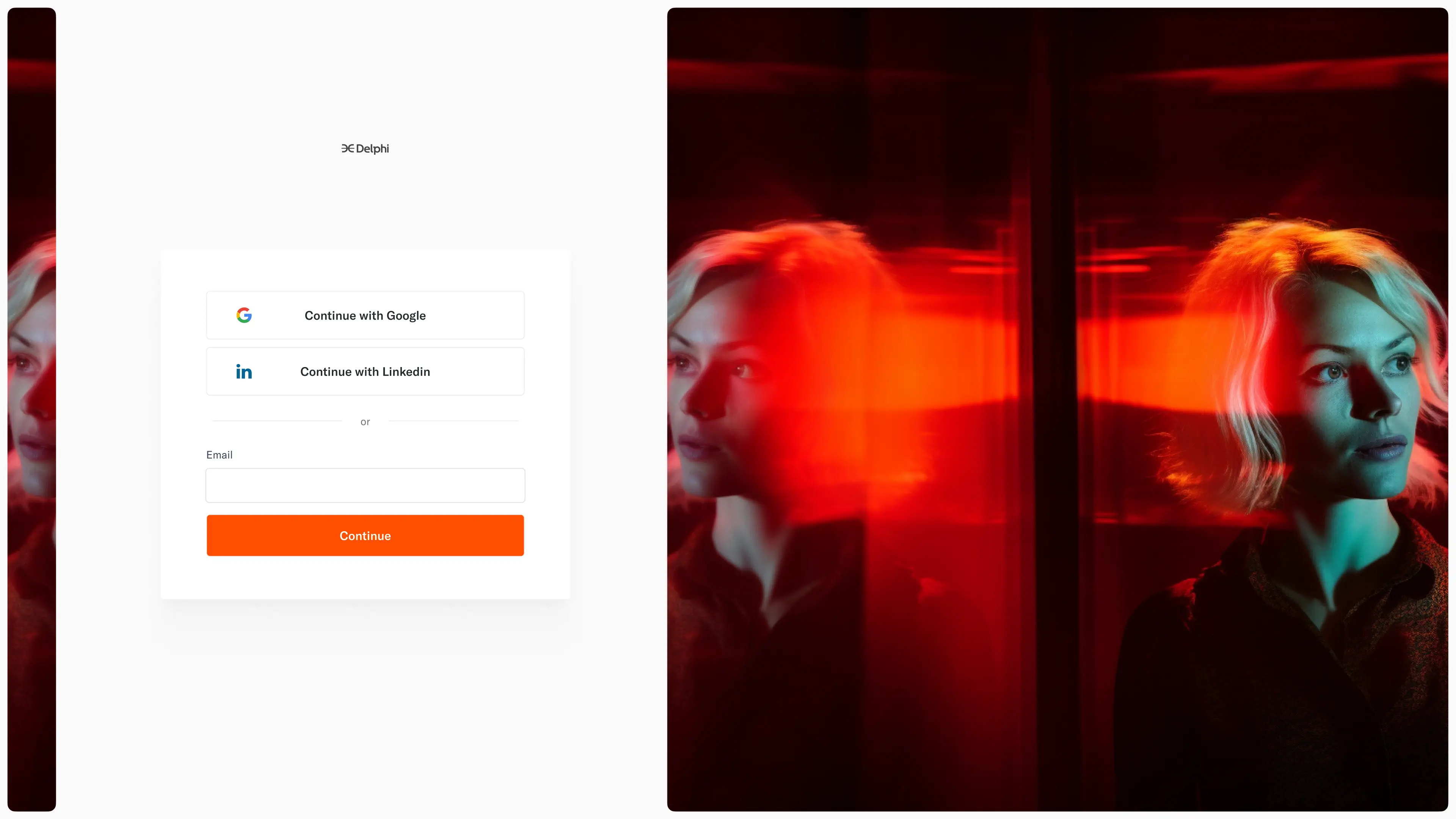
Sign In
/ Delphi / Product Design
Sign in page with SSO or magic link. Art of woman in The Chamber.
Sign In
/ Delphi / Product Design
Sign in page with SSO or magic link. Art of woman in The Chamber.
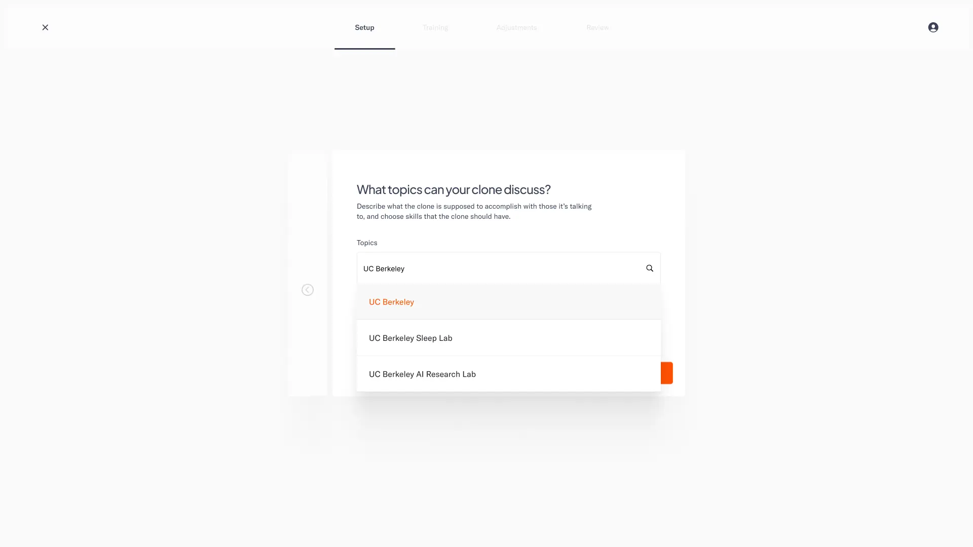
Onboarding, Choose Topic
/ Delphi / Product Design
During clone creation, choose topics your clone should know about.
Onboarding, Choose Topic
/ Delphi / Product Design
During clone creation, choose topics your clone should know about.
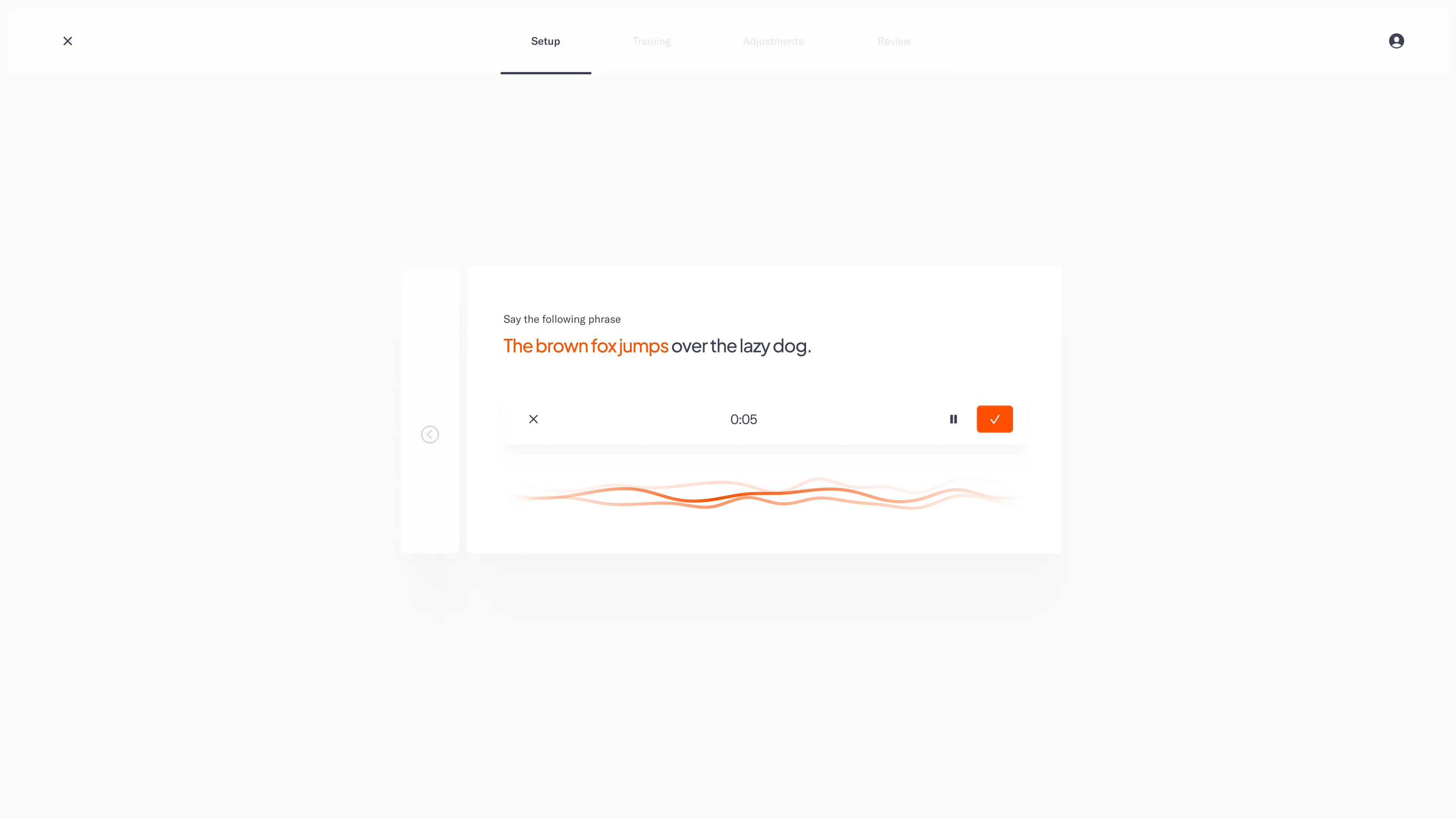
Onboarding, Voice Capture
/ Delphi / Product Design
Capture voice for clone to mimic.
Onboarding, Voice Capture
/ Delphi / Product Design
Capture voice for clone to mimic.
/ Contact
/ ABOUT
Dimitri Knight is a product designer. He studied how the mind perceives, understands, and makes meaning at University of California, Berkeley. He's designed games since the age of twelve, and has since worked full-time as a product designer on finance, real estate, and AI products.
© Copyright 2024. Dimitri Knight. All Rights Reserved.
Designed in San Francisco, California
/ Contact
/ ABOUT
Dimitri Knight is a product designer. He studied how the mind perceives, understands, and makes meaning at University of California, Berkeley. He's designed games since the age of twelve, and has since worked full-time as a product designer on finance, real estate, and AI products.